How to Mix Acrylic Paint Colors A Guide for Artists

To confidently mix any color you can imagine with acrylics, you first need to get a handle on its three essential properties: hue, value, and chroma. Simply put, hue is the color itself (like red or blue), value is how light or dark it is, and chroma is its intensity. Understanding these three elements is what takes you from hopeful guesswork to having precise, predictable control over your palette.
Understanding the Foundations of Color Mixing
Mastering color mixing isn't about owning every tube of paint under the sun. It all starts with a solid grasp of color theory. This knowledge is the bedrock that separates a vibrant, intentional palette from a muddy, accidental mess. It’s the language you use to translate the colors from your mind's eye—or from the world around you—onto the canvas with both accuracy and feeling.
A common stumbling block for painters is the idea that there's just one "true" red, yellow, or blue. The reality is that every pigment has a temperature bias; it leans either warm or cool. A warm Cadmium Red, for instance, will give you a completely different orange when mixed with yellow than a cool Alizarin Crimson will. Recognizing these subtle biases is a game-changer.
Before we jump into mixing, let's break down the core concepts you'll be working with. These terms are the building blocks for every color decision you make.
Core Color Mixing Terminology
| Term | Definition | Practical Application |
|---|---|---|
| Hue | The pure color family, like red, yellow, or blue. | Identifying the base color you want to create (e.g., "I need a green."). |
| Value | The lightness or darkness of a hue. | Adding white to lighten (create a tint) or black to darken (create a shade) for contrast and form. |
| Chroma | The purity, intensity, or saturation of a color. | Mixing in a complementary color or a neutral grey to reduce intensity for more naturalistic tones. |
Getting comfortable with this vocabulary is the first step toward mixing with intention rather than just by chance.
If you take one thing away from this, let it be this: learning to see and manipulate hue, value, and chroma is the single most important skill for mixing color. It's how you'll analyze a color you want to create and know exactly how to get there.
The Power of a Limited Palette
Instead of getting lost in a sea of paint tubes, I always advise artists to start with a limited palette. It sounds counterintuitive, but it's incredibly freeing. A simple collection—a warm and cool version of each primary (red, yellow, blue), plus Titanium White and maybe an earth tone like Burnt Umber—is all you really need.
Working this way forces you to truly learn how your colors interact, building a deep, intuitive knowledge that you just can't get otherwise. Many of the rich, complex colors you see in impressionistic painting techniques are the result of clever mixing from a surprisingly small selection of paints. Not only does this approach save you money, but it also creates an automatic sense of harmony in your work, because every color on your canvas shares a common DNA.
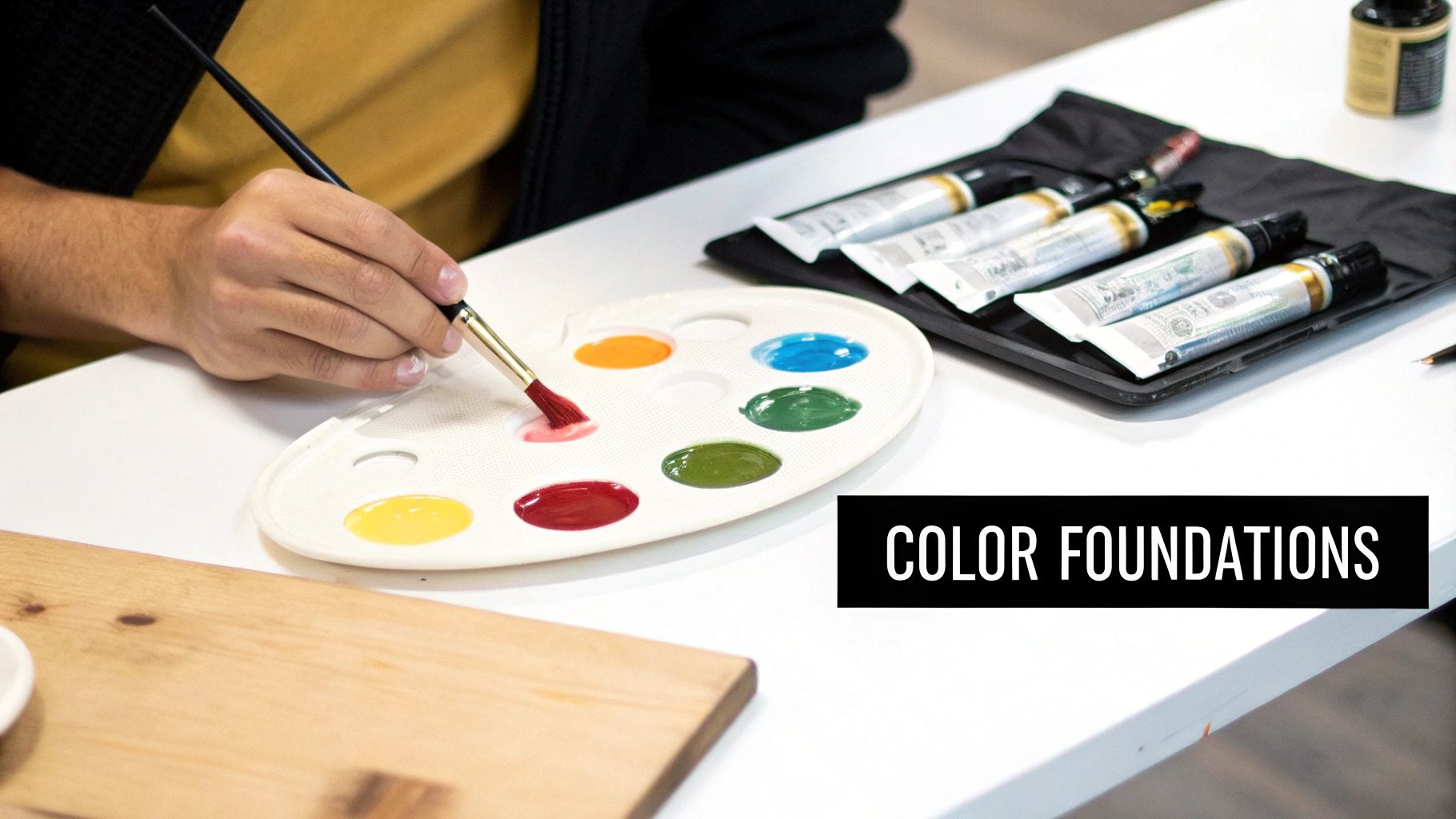
Setting Up Your Palette for Clean Color Mixes
The secret to clean, vibrant color mixing isn't just about theory; it starts with how you set up your workspace. A chaotic palette almost always leads to muddy, unintentional colors that can derail a painting session. Taking a few moments to organize your tools and paints is one of the most important habits you can build.

This simple prep work ensures that the colors you create are pure and intentional, letting you focus on the actual joy of painting.
Choose Your Mixing Surface Wisely
The surface you choose for mixing your paints can genuinely impact your workflow. There’s no single right answer, as each has its own benefits depending on how you like to paint.
- Glass Palettes: A simple sheet of glass is my personal go-to. It’s perfectly non-absorbent, so you can scrape up every last bit of paint, and cleanup is a breeze. Once the acrylic has dried, it peels right off with a razor scraper.
- Disposable Paper Palettes: These are fantastic for quick studies or when you just don’t have time for cleanup. You simply tear off the top sheet and toss it. While they're incredibly convenient, the cost can add up over time.
- Stay-Wet Palettes: If you've ever felt rushed by acrylics' fast drying time, these can be a game-changer. A damp sponge sits beneath a special permeable paper, keeping your paints wet and workable for hours—sometimes even days. This is great for preventing waste and allows for a much more relaxed painting process.
Why a Palette Knife Is Essential
It might feel intuitive to mix colors with your brush, but I strongly advise against it. The bristles of a brush are notorious for trapping small amounts of pigment, which can then contaminate your next mixture. This is one of the most common ways painters end up with muddy colors.
A palette knife, on the other hand, gives you complete control. Its smooth, non-porous surface lets you thoroughly blend pigments together, and you can wipe it perfectly clean in an instant. This guarantees that every color you mix is pure and exactly what you intended.
Arranging your colors logically is more than just organization—it's about building muscle memory. An intuitive layout allows you to reach for colors without breaking your creative flow, making the mixing process feel like a seamless extension of your thoughts.
I always lay out my paints around the edge of my palette following the color wheel: yellows into oranges, reds, violets, blues, and then greens. I keep a large dollop of white in a central, accessible spot. This setup makes it second nature to see color relationships and grab what I need. If you're still gathering your supplies, our guide on how to start painting with acrylics covers all the essential gear.
One last studio tip: use two water pots. I keep one for rinsing warm colors (reds, yellows, oranges) and another for cool colors (blues, greens). This small habit makes a surprisingly big difference, drastically reducing the chance of accidentally neutralizing your beautiful mixes on the brush.
Mastering Tints, Tones, and Shades
When you move past just mixing basic hues, you start to unlock real control over the mood and dimension in your work. This is where mastering tints, tones, and shades comes in. It’s about much more than just adding white, gray, or black. It's about truly understanding how these small adjustments can shape the entire atmosphere of your painting, turning flat patches of color into believable light and shadow.
So many painters, when they're starting out, are taught to just add black to darken a color. The problem is, this almost always leads to a flat, lifeless result. Black pigment can be a bully; it often overpowers a color, stripping it of all its character and vibrancy. Luckily, there are far better ways to mix rich, natural-looking shadows.
Creating Sophisticated Shades
Instead of instinctively reaching for that tube of pure black, try mixing a color with its complement. For instance, adding just a touch of green to red will both neutralize and darken it, creating a deep, complex shadow that still feels like it belongs to the red family. Another one of my go-to techniques is to use a dark earth tone, like Burnt Umber, as my primary darkener.
I find this method indispensable for my seascapes. To capture the deep, shadowy undersides of a wave, I'll mix my Ultramarine Blue with a bit of its complement, Burnt Sienna. The result is a dark, nuanced blue that feels so much more alive than if I had simply dumped in some black paint. That shadow color becomes dynamic, full of subtle temperature shifts that give the water a real sense of movement and depth. Learning how to mix these complex neutrals can also add incredible texture in your paintings.
The Nuance of Tints and Tones
Creating tints by adding white seems simple enough, but it requires a careful touch. White pigment, especially Titanium White, can dramatically cool a color down and reduce its intensity, sometimes leaving your mix looking a bit chalky.
Here’s a practical example: when I'm painting the sunlit crest of a wave, I’ll add white to my blue, of course. But I’ll also mix in a tiny pinprick of Cadmium Yellow. That little touch of warmth works against the cooling effect of the white, making the highlight feel genuinely illuminated by warm sunlight, not just lightened.
Tones, which you create by adding gray, are really the unsung heroes of a believable palette. They are absolutely essential for painting anything in diffuse light or for creating those subtle shifts in atmospheric perspective that give a landscape its sense of vastness.
The most convincing paintings are not built on pure, high-chroma colors. They are built on the subtle relationships between tints, tones, and shades, which together create a believable world of light, form, and atmosphere.
A Practical Exercise for Value Control
One of the best ways to train your eye is to create a full value scale for a single color. It's a simple exercise, but it builds an almost intuitive understanding of how to control lightness and darkness.
- Start with a pure hue, like Ultramarine Blue, in the center of your palette.
- Working in one direction, gradually mix in small amounts of Titanium White. Create a series of five to seven distinct tints, moving from light blue to almost pure white.
- Now, go the other way. Add tiny increments of Burnt Umber to your pure blue to create a corresponding series of shades, moving from the original hue to a deep, dark blue-brown.
Doing this gives you a visual map of a single color's incredible potential. It's a real eye-opener. The data from artists' studies backs this up: adding black can muddy as many as 75% of color mixes, whereas a dark brown or a complementary dark cleanly darkens the color in over 92% of cases.
A great habit to get into is keeping a journal of your favorite mixing recipes. Noting that "warm sand = 50% Cadmium Yellow + 25% white + 5% ochre" can cut your remixing time down by as much as 60%. For more helpful tips, you can explore the acrylic paint color mixing guide on Cowling & Wilcox.
7 Practical Color Mixing Recipes for Your Next Painting
Theory is great, but the real fun begins when you put paint on the palette. Let's move from abstract concepts to the canvas and mix some of the most common colors you'll need for landscape and impressionistic work. Think of these less as rigid formulas and more as reliable starting points. Over time, you’ll tweak them to develop a palette that’s uniquely yours.
Starting Point Color Mixing Recipes
Use these foundational recipes as a guide for mixing common colors found in nature and portraits. Remember to adjust the ratios to achieve your desired hue.
| Target Color | Base Paints | Mixing Notes |
|---|---|---|
| Warm, Sunlit Green | Cadmium Yellow Light + Ultramarine Blue | This is my go-to for sunny fields and foliage. The Ultramarine adds a natural warmth that pre-mixed tube greens often lack. Start with the yellow and slowly add tiny bits of blue. |
| Cool, Shadow Green | Cadmium Yellow Light + Phthalo Blue | Swap the Ultramarine for Phthalo Blue when you need the cooler green found in the shadows of trees or on an overcast day. Phthalo is strong, so a little goes a long way. |
| Clear Blue Sky | Titanium White + Phthalo Blue | The key here is subtlety. Start with a generous amount of white and add the tiniest speck of Phthalo Blue on the corner of your knife, mixing until you get that perfect, crisp sky. |
| Stormy Gray Sky | Ultramarine Blue + Burnt Sienna + Titanium White | This combination creates a complex, atmospheric gray that feels much more alive than a simple black and white mix. The Burnt Sienna beautifully neutralizes the blue. |
| Tropical Turquoise Water | Phthalo Blue + Cadmium Yellow | For that brilliant, glowing turquoise of a tropical sea, mix a small amount of yellow into your Phthalo Blue. It’s an incredibly vibrant and satisfying mix. |
| Warm Sandy Beige | Yellow Ochre + Titanium White + touch of Burnt Sienna | This is perfect for beaches or dry grasses. The Yellow Ochre provides the earthy base, white lightens it, and the smallest touch of Burnt Sienna gives it a sun-baked warmth. |
| Deep, Rich Earth | Burnt Umber + Ultramarine Blue | When you need the color of damp soil or the deep shadows on tree bark, adding a bit of Ultramarine Blue to Burnt Umber cools it down and gives it a wonderful, organic depth. |
These recipes give you a solid foundation, but value—the lightness or darkness of a color—is what will truly bring your paintings to life.
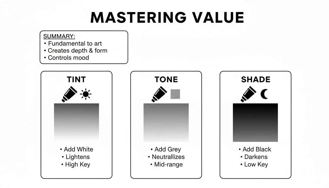
Mastering how to create tints (adding white), tones (adding gray), and shades (adding black or a dark complement) is what gives your mixed colors dimension and mood.
A Few Words on Skies and Water
Skies and water often share a similar palette, but you'll want to approach them differently to capture their unique character on the canvas.
For water, especially deeper, more turbulent oceans, I often start with Ultramarine Blue and darken it with its complement, Burnt Sienna. This creates a rich, dark neutral that feels more natural than black. Remember, water is all about what it reflects. You can dive deeper into this with our guide on how to paint water reflections.
The secret to clean, vibrant mixes is to be efficient. Overworking your paint or throwing too many pigments into the mix is a surefire way to get mud. The most direct path between two colors on the color wheel will almost always give you the purest result.
This isn't just a feeling; it's backed by what’s known as the General Mixing Rule. Following this can boost your chroma richness by 50% and cut down the amount of paint you need by nearly 70%.
For example, if you need a deep teal, reaching for Phthalo Blue and adding just 10-15% of a cool yellow is far more effective than trying to mix it from all three primaries. That's a recipe for a dull, muddy mess. Keeping your mixes simple is one of the best habits you can build.
Advanced Strategies for Creating Unique Hues
Once you’ve got the fundamentals down, the real fun begins. It's time to move past standard color recipes and start crafting the unique hues that will become a signature of your work. This means looking deeper into the pigments themselves and maybe even rethinking the "primary" colors that form the foundation of your palette.
One of the most effective ways to do this is to explore the CMYK model—Cyan, Magenta, Yellow, and Key (Black). While our art classes drilled Red, Yellow, and Blue into us, the CMYK system used in professional printing can unlock a much wider spectrum of clean, brilliant colors. It’s a different way of thinking, for sure, but it offers incredible precision.
Artist Daniel Kenneth has done some fascinating work adapting this model for acrylics, managing to match digital colors on his canvas with up to 90% accuracy. His approach hinges on a key insight: CMYK percentages on a screen represent surface coverage, not the volume of paint to be mixed. This shift in thinking can also cut down on paint waste by a surprising 40%. You can dive deeper into his CMYK mixing technique on his website.
Leveraging Pigment Characteristics
Not all paints are created equal. Every tube of color has its own personality, and understanding these inherent properties is what separates good mixers from great ones. The two most important characteristics to get a handle on are transparency and opacity.
-
Opaque Pigments: Think of colors like Cadmium Red or Yellow Ochre. They provide solid, flat coverage and are fantastic for blocking in the first layers of a painting or making a bold, definitive statement.
-
Transparent Pigments: Colors like Quinacridone Magenta or the Phthalo family (Blue and Green) let light pass right through them. With their high tinting strength, they are absolute workhorses for creating luminous glazes or deep, complex shadows.
Knowing which tool to pull from the toolbox and when will elevate your work dramatically. When I'm working on a seascape, for instance, I might lay down an opaque Cerulean Blue for the initial sky, then glaze over it with a transparent Ultramarine to build that sense of atmospheric depth. It's a simple but powerful way to add complexity when painting seascapes with acrylics.
Your choice of pigment directly impacts the final feel of a color. A red mixed with opaque Cadmium Yellow will feel solid and earthy, while the same red mixed with a transparent Hansa Yellow will have a glowing, jewel-like quality.
Building Depth with Glazing
This is where transparent pigments truly shine. Glazing is a classic technique that involves applying very thin, see-through layers of paint over a dry underpainting. Each new layer subtly alters the color beneath it, creating a visual richness and depth that you just can't get from a single, flat application of opaque paint.
This method is incredibly effective for developing complex shadows or adding subtle color shifts to an area. A thin wash of Alizarin Crimson over a cool green underpainting, for example, can create a beautifully nuanced shadow that feels much more alive than a simple mix of green and black ever could. This is how you mix acrylic paint colors to achieve that professional, luminous finish we all strive for.
A Painter's Q&A: Solving Common Acrylic Mixing Problems
Even after you've learned the rules of color theory, putting them into practice on the palette is a whole different ball game. Questions always pop up in the middle of a painting session. Let's walk through some of the most common challenges I see painters face and figure out how to get you back to painting with confidence.
Why Do My Mixed Colors Look So Muddy?
This is probably the number one frustration I hear about. Muddy colors usually happen for one of two reasons: you're either overworking the paint with too many pigments or you've accidentally neutralized your color.
As a rule of thumb, try to stick to mixing just two or three colors at a time. The more tube colors you add to a single puddle of paint, the more you cancel each other out, inching ever closer to a lifeless brown or gray.
The other culprit is often a misunderstanding of complementary colors. A touch of green can create a beautiful, deep shadow in a red, but add just a bit too much, and you’ll completely kill the red’s vibrancy. It's a delicate balance.
Here's a studio habit that will save you a world of frustration: keep your tools clean. A palette knife with a bit of old blue on it will instantly contaminate your bright new yellow. Wipe everything down between mixes—it's non-negotiable for clean color.
How Can I Possibly Mix the Same Color Twice?
Ah, the age-old challenge of recreating that perfect hue you mixed an hour ago. The most practical advice I can give is to always mix more paint than you think you'll need. It feels wasteful at first, but trying to match a tiny batch later is far more difficult.
To get better at this over time, start a "recipe book" in a sketchbook. When you create a mix you love, paint a small swatch and jot down the colors and approximate ratios you used to get there.
- Example Recipe: Seafoam Green
- Formula: About 2 parts Titanium White + 1 part Phthalo Blue + just a pinprick of Cadmium Yellow Light.
This little book will become your most trusted studio assistant. When you need that color again, you have a solid starting point. You can then add tiny amounts of each color, constantly dabbing the new mix next to the original on your canvas until it disappears.
What's the Best Way to Lighten a Color Without That Chalky Look?
Reaching for Titanium White is almost instinct, but it can quickly cool down a color and give it a chalky, pastel look that drains all the life out of it. To keep your colors vibrant as you lighten them, try adding a lighter analogous color instead.
For example, if you want to lighten a red, don't just dump in white and create a flat pink. Try adding a bit of a warm Cadmium Yellow or a bright orange. This raises the value while keeping the original warmth and intensity of the red alive.
Another pro-level trick is to use Zinc White. It’s much more transparent than titanium, so it lightens a color more gently. Or, for a totally different effect, you can simply thin your paint with a glazing medium. This makes the color more transparent, letting the white of the canvas shine through to lighten it optically, which creates a wonderful sense of luminosity.
At Skyler’s Art, every piece is a testament to the power of color and personal expression. Discover original paintings that bring the energy of the sea and the quiet of nature into your space. Explore the collection at skylers-art.org.