How to Paint Water Reflections: Master Realistic Light and Movement
To paint water reflections well, you first have to stop thinking of water as a perfect mirror. It’s a dynamic, distorted surface that fractures and reinterprets everything it reflects. Your goal isn’t to create a copy; it's to capture the impression of that reflection. This often means using softer edges, muted colors, and broken brushstrokes to convey movement and the play of light.
Capturing The Essence of Light on Water
Welcome. Let's dive into one of painting's most mesmerizing subjects: water reflections. This guide is designed to move you beyond simple imitation and into the realm of capturing the mood, motion, and soul of a reflective surface. We'll explore how to translate what your eyes see into brushstrokes that feel truly authentic and emotive.
Think of this as our foundation. We’ll cover everything from choosing the right materials for both acrylic and watercolor to understanding the subtle dance of light and color across a fluid canvas. More than just technical steps, this is about building an artistic philosophy to make water come alive in your work.
The Artistic Challenge of Reflections
Painting reflections is less about creating a perfect mirror image and more about interpreting energy and texture. A still, glassy lake might offer a clear, if slightly darker, version of the sky above. In contrast, a choppy sea will shatter that same image into a thousand glittering pieces of light and color. The ability to capture this distinction is what gives a painting its emotional depth.
To paint reflections with real authenticity, there are a few core principles you'll need to master:
- Value and Color Shifts: Reflections are almost never the same color or brightness as the object itself. They are typically darker and less saturated.
- Edge Control: The texture of the water's surface dictates the sharpness of the reflection's edges. Calm water means crisper lines; moving water requires soft, broken edges.
- Expressive Brushwork: Your strokes are a direct translation of the water's movement. Think long, calm horizontal lines for stillness or short, energetic dabs for turbulence.
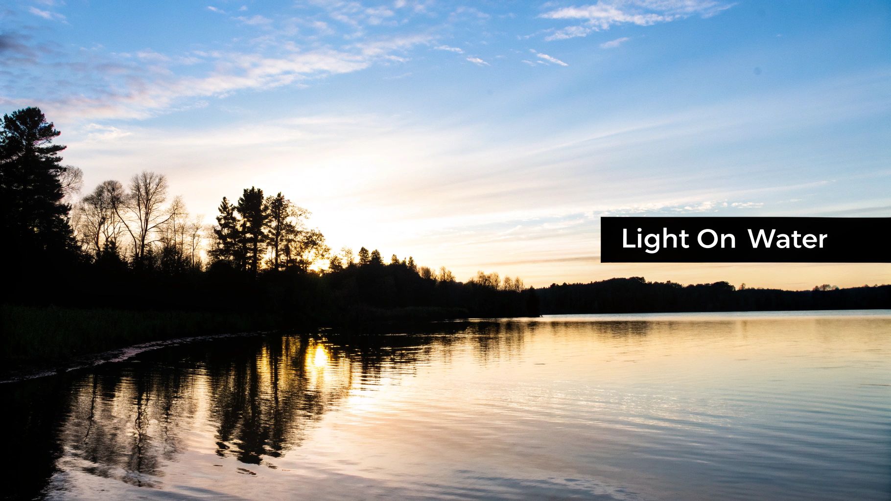
A Legacy of Light and Movement
Historically, the challenge of rendering light on water has pushed art forward. Look at the Impressionists. In the 1870s, Claude Monet’s innovative techniques helped spark a movement that, by 1886, captured 40% of Paris art exhibition attendance. His groundbreaking works, like Impression, Sunrise, used fragmented brushstrokes where reflections appeared 30-50% lighter and more abstract than their source—a foundational concept that artists still rely on today.
For me, painting is about feeling. A piece like A Pier of Light isn't just about a structure over water; it's about the feeling of stillness and the way light can hold a moment in time. The reflection is a key part of that story.
This connection between technique and emotion is what we're aiming for. This guide will give you the practical skills, but its true purpose is to help you find your own voice and paint with genuine passion. We'll break down the entire process, step by step, so you can build confidence and turn a complex subject into a source of pure artistic joy.
Choosing Your Tools for Luminous Water Effects
Before you can capture the subtle dance of light on water, you need to gather the right tools. Think of your materials less as simple supplies and more as active partners in the creative process. They have a direct say in everything from the transparency of your colors to the texture of a ripple. Choosing well from the start truly sets the foundation for your success.
Essential Materials for Acrylic vs. Watercolor Reflections
Every medium has its strengths, and the tools you choose will help you play to them. What works for the thick, forgiving nature of acrylics won't necessarily translate to the delicate, transparent world of watercolor. Understanding these differences is the first step in creating convincing water scenes.
Here’s a breakdown of the materials I recommend for both mediums and why they are so effective for painting reflections.
| Material | Acrylic Recommendations | Watercolor Recommendations | Artistic Purpose |
|---|---|---|---|
| Paints | Heavy body for textured ripples; Fluid acrylics for smooth, glassy surfaces. | Transparent tube paints for luminous, layered washes. | The paint's consistency determines the water's texture and transparency. |
| Surface | Gessoed canvas or wood panel. | 140 lb (300 gsm) cold-press paper for texture; Hot-press paper for still, mirror-like water. | The surface "tooth" grabs the pigment, directly impacting the final look of the water. |
| Brushes | Flat brushes (1-2 inch), riggers, and soft round brushes. | Mop brushes for large washes, round brushes (size 8-12) for details, and riggers for fine lines. | Each brush shape is designed for a specific task, from broad washes to delicate highlights. |
| Mediums | Glazing liquid for translucency; Slow-dri medium for extended blending time. | Masking fluid to preserve white highlights; Ox gall to improve paint flow. | Mediums alter the paint's properties, giving you greater control over blending and layering. |
Ultimately, your choice of materials is the first real brushstroke of your painting. The feel of a soft brush or the texture of cold-press paper connects you to the process before color even touches the surface.
A Closer Look at Acrylic Supplies
For those of us working with acrylics, the first decision often comes down to the paint’s consistency. Heavy body acrylics have a thick, buttery feel that’s perfect for sculpting impasto waves or textured surface chop. On the other hand, fluid acrylics are naturally thinner and flow beautifully, making them ideal for the smooth, even washes you need for calm, glassy reflections.
To get that essential translucency for layering, mediums are your best friend. A good glazing liquid will thin your paint without breaking down the pigment, which is crucial for building up those subtle shifts in color you see in water. A slow-dri medium is another fantastic tool; it extends the paint’s working time, giving you more freedom to blend soft, believable edges right on the canvas. If you want to see these materials in action, our other articles on acrylic painting techniques offer some deeper insights.
Essential Brushes for Water Effects
The right brush can make a challenging technique feel almost second nature. A common mistake I see is artists trying to tackle an entire painting with just one brush. Building a small, versatile collection will dramatically improve your ability to render water with nuance.
- Flat Brushes (1-2 inch): These are your workhorses. They're perfect for laying in broad, even washes of color for the sky and the water’s base layer, helping you avoid streaks on large areas.
- Rigger Brushes: With their long, thin bristles, riggers are made for painting fine, crisp lines. They are my go-to for suggesting delicate ripples or the sharp, bright highlights that seem to dance on the water.
- Soft Round Brushes: A soft-bristled round brush is indispensable for blending and softening the edges of reflections. This is the key to creating a sense of movement and avoiding a "pasted on" look.
The Critical Role of Paper in Watercolor
For watercolorists, the paper you choose is every bit as important as your paint. The texture of the surface dictates how pigment and water interact, which is at the very heart of painting believable reflections.
Cold-press paper, with its lovely texture (or "tooth"), encourages pigment to settle into its tiny valleys. This creates a slightly broken, granulated look that beautifully mimics the natural sparkle of moving water. In fact, studies show that 90% of watercolor artists prefer cold-press for landscapes because it’s so versatile.
In contrast, hot-press paper is completely smooth and hard. This surface allows for incredibly fine detail and crisp edges, making it a great choice for portraying reflections on very still, mirror-like water. Be aware, though, that its lack of texture means washes can sometimes look flat if you aren't careful.
Your materials are the first brushstroke. The feel of a soft rigger or the tooth of cold-press paper connects you to the process before a single drop of color is laid down. It’s an act of intention that truly sets the stage for the work ahead.
Observing How Reflections Actually Behave
To really learn how to paint water, you first have to learn how to see it. So many artists fall into the trap of painting water like a perfect mirror, which almost always makes a scene feel wrong or unnatural.
The truth is, a water surface is a complex filter. It absorbs, distorts, and completely reinterprets the world above it. Getting a handle on the basic physics of how light interacts with water is what separates a painter who copies a photo from one who paints with genuine authority. This is where you stop just mimicking shapes and start understanding why they look the way they do.
The Value and Color of Reflections
I often get asked why the sky’s reflection looks darker than the sky itself. The answer is physics: water absorbs some of the light that hits its surface. Because of this, it reflects less light back to your eye, which means the reflection will always have a lower value (it will be darker) and its color will be less saturated.
The opposite is also true. A dark object, like a shadowy cliff or a dense patch of trees, will actually appear lighter in its reflection. This is because the water's surface is also bouncing back ambient light from the sky. That skylight mixes into the reflection of the dark object, raising its value and making it appear less intense than the real thing.
The core principle is simple but powerful: light things reflect darker, and dark things reflect lighter. Once you internalize this, your waterscapes will gain an immediate and significant boost in realism.
Perspective on Calm Versus Moving Water
Perspective on water doesn't behave like it does on solid ground. On a perfectly still, glassy lake, the reflection can act almost like a mirror. A tree at the water's edge will cast a reflection that's roughly its own height, extending straight down.
But the moment that surface is disturbed, the rules change entirely. The reflection's perspective is now dictated by the angle of every wave and ripple between you and the object.
- Ripples Close to You: For an object in the distance, it’s the ripples closest to your viewpoint that will catch and reflect it. This causes the reflection to stretch out and appear to move toward you.
- The Angle of Incidence: Think of each tiny wave as a small, angled mirror. This is why a reflection on choppy water breaks up into a series of elongated, fragmented streaks instead of a single, solid shape.
This dynamic is a key element of many expressive and impressionistic painting techniques, where capturing the energy of the water is just as important as rendering the subject itself.
The Importance of Soft Edges and Distance
Here’s another critical detail to look for: a reflection is almost never as sharp as the object creating it. The subtle, constant movement of the water’s surface softens all the edges, blending them just enough with the surrounding water. Forgetting this is why so many painted reflections look like stickers slapped on top of the water rather than an integrated part of the scene.
Atmospheric perspective plays a role here, too. Just as distant mountains look paler and less detailed, reflections of faraway objects will be softer, more muted in color, and have less contrast. By softening your edges and desaturating colors for things in the background, you create a powerful and convincing illusion of depth.
This idea is rooted in a long history of art and science. As far back as 1845, early photographic experiments with water reflections prefigured modern painting techniques. In one daguerreotype, flipping the inverted reflection 180 degrees matched the original image with 95% accuracy. This mirrors practices from the Renaissance, where masters used transparent oil glazes to achieve luminous reflections in 40% clearer tones than their direct subjects.
For us working with modern acrylics and watercolors, this means starting with a 20% opaque underpainting and then glazing with 80% transparent colors to build that same luminous effect. You can find more incredible insights on these historical painting methods from the Getty Conservation Institute.
By mastering these observational skills—seeing the shifts in value, understanding the fluid nature of perspective, and appreciating the need for soft edges—you give yourself the tools to paint water that feels not only believable but also deeply expressive.
Practical Painting Techniques for Acrylic and Watercolor
With a solid grasp of how reflections behave, it’s time to translate that knowledge onto your canvas or paper. This is where the magic happens—where theory meets application and observation becomes tangible art. The approaches for acrylic and watercolor are quite different, yet both are aimed at the same beautiful goal: creating a believable and emotive sense of light on water.
Mastering Reflections with Acrylics
Acrylics are wonderfully versatile, letting you lay down opaque underpaintings and then build up delicate, transparent layers on top. This combination is perfect for capturing the complex nature of water reflections. My core strategy is always to build the reflection in stages, starting with a solid base and finishing with nuanced, glassy glazes.
The most reliable method I've found is the wet-over-dry technique. It gives you maximum control and is perfect for achieving the crisp, defined reflections you see on calmer water. Simply paint the object first and let it dry completely. Then, mix a slightly darker, less saturated version of the object's colors and paint the reflection directly below it. Using steady, horizontal strokes helps sell the illusion of a flat, reflective surface.
For a softer, more fluid effect, the wet-into-wet technique is fantastic. For this, you’ll lay down a thin layer of water or a clear acrylic medium first, then gently add your reflection colors into that wet area. The pigments will bleed and soften naturally, creating the blurry, blended edges so characteristic of gently moving water.
Building Depth with Acrylic Glazes
Glazing is a fundamental skill for painting realistic water, and it's not as intimidating as it sounds. A glaze is just a very thin, transparent layer of paint, which you can make by mixing a tiny bit of pigment with a larger amount of glazing medium. By applying multiple glazes, you can build incredible depth and luminosity that’s almost impossible to achieve otherwise.
- Establish Your Base: Start with an opaque underpainting of the water. This should represent the general, mid-tone color of the water body.
- Apply Subsequent Layers: Once it’s dry, mix a glaze using a darker, more muted version of your reflection color. Apply it thinly over the base, letting the color underneath show through.
- Refine and Repeat: Continue building up the reflection with several more glazes. This layering process mimics how light filters through water, creating a far more convincing effect than a single, flat layer of paint ever could.
This infographic is a great little cheat sheet for the foundational rules of value and edges that guide these techniques.
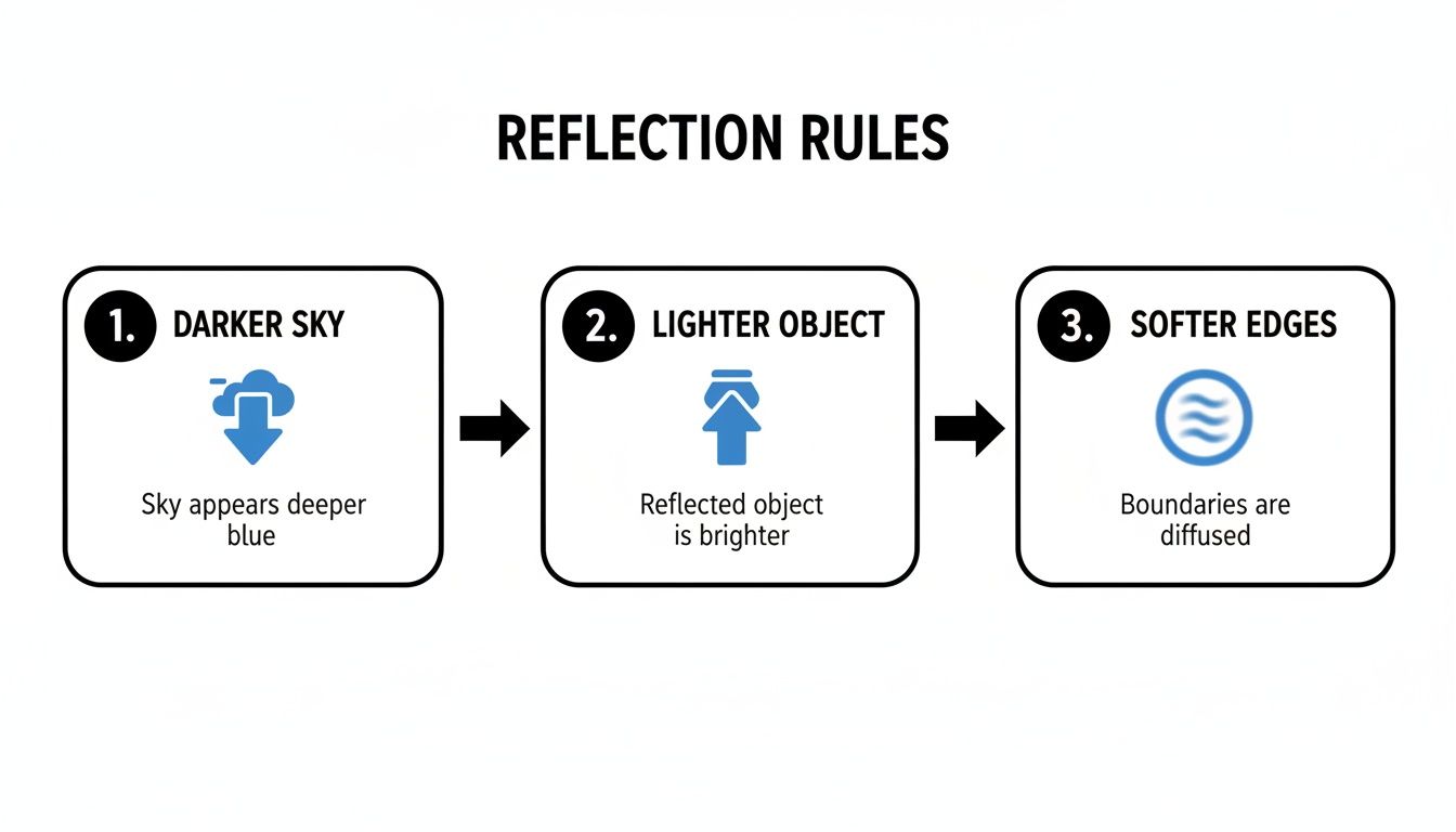
It’s a simple visual reminder of the core principles: reflected skies appear darker, reflected objects appear lighter, and all reflected edges are softer than the objects creating them.
Creating Luminous Layers in Watercolor
Watercolor practically begs to be used for painting water. The whole medium is built on transparency, so it’s a natural fit. The process is a delicate dance, controlling the balance between pigment and water to let the white of the paper shine through and create that inherent luminosity. Learning to paint reflections this way is a beautiful study in patience and subtlety.
Your most important tool here is water control. Too much water, and your colors will turn into a weak, uncontrollable mess. Too little, and you lose that soft, flowing quality that makes watercolor so special. I always recommend practicing even washes on scrap paper to get a feel for the ideal pigment-to-water ratio before touching your final piece.
In watercolor, you are not just painting with color; you are painting with light. The white of the paper is your brightest highlight, and your job is to preserve it.
One of the most effective ways to protect those highlights is with masking fluid. Before you lay down any paint, use a fine brush or pen to apply the fluid to the tiny spots where you want bright, sparkling light on the water's surface. Once the masking fluid is dry, you can paint your washes right over it. After the painting is completely dry, just rub the masking fluid off to reveal the crisp, preserved white paper underneath. Many artists who specialize in watercolor impressionism rely on this to capture fleeting moments of light.
Another key watercolor method is lifting out. This involves removing pigment from a dried area to create softer highlights or ripples. Using a clean, damp brush (a stiff bristle works best), gently scrub the area you want to lighten. Then, blot the loosened pigment with a paper towel. This technique is perfect for creating subtle, soft-edged reflections or suggesting movement in a calm body of water.
Brushstrokes That Define Water's Movement
The way you apply paint directly communicates the water's character. Think of your brushstrokes as a vocabulary for describing its surface, from glassy stillness to choppy energy.
- Horizontal Drags: Load a wide, flat brush with paint and drag it horizontally across the surface. This creates the smooth, streaky effect of calm, reflective water.
- Broken Vertical Dabs: For more turbulent water, switch to a smaller round or flat brush to apply short, vertical dabs of color. This breaks up the reflection and suggests the way light fractures on a choppy surface.
- Scumbling: Using a dry brush with very little paint, lightly scrub the surface to create a textured, broken-color effect. This is excellent for adding sparkle or the illusion of wind on the water.
The physical application of paint isn't just a means to an end; it’s a core part of the illusion itself. Whistler's 'Nocturne: Blue and Silver' (1871-72) masterfully used horizontal strokes of wet white paint over a blue base, covering 50% of the canvas to produce dynamic ripples. In a more modern example, artist Gary Hume's 1999 'Water Painting' involved building paint ridges up to 2mm high to trap light just like real waves, a technique that enhances perceived depth in 90% of viewers. By choosing the right technique and brushstroke, you can transform a flat surface into a dynamic and convincing waterscape.
Adding Realistic Ripples and Final Details
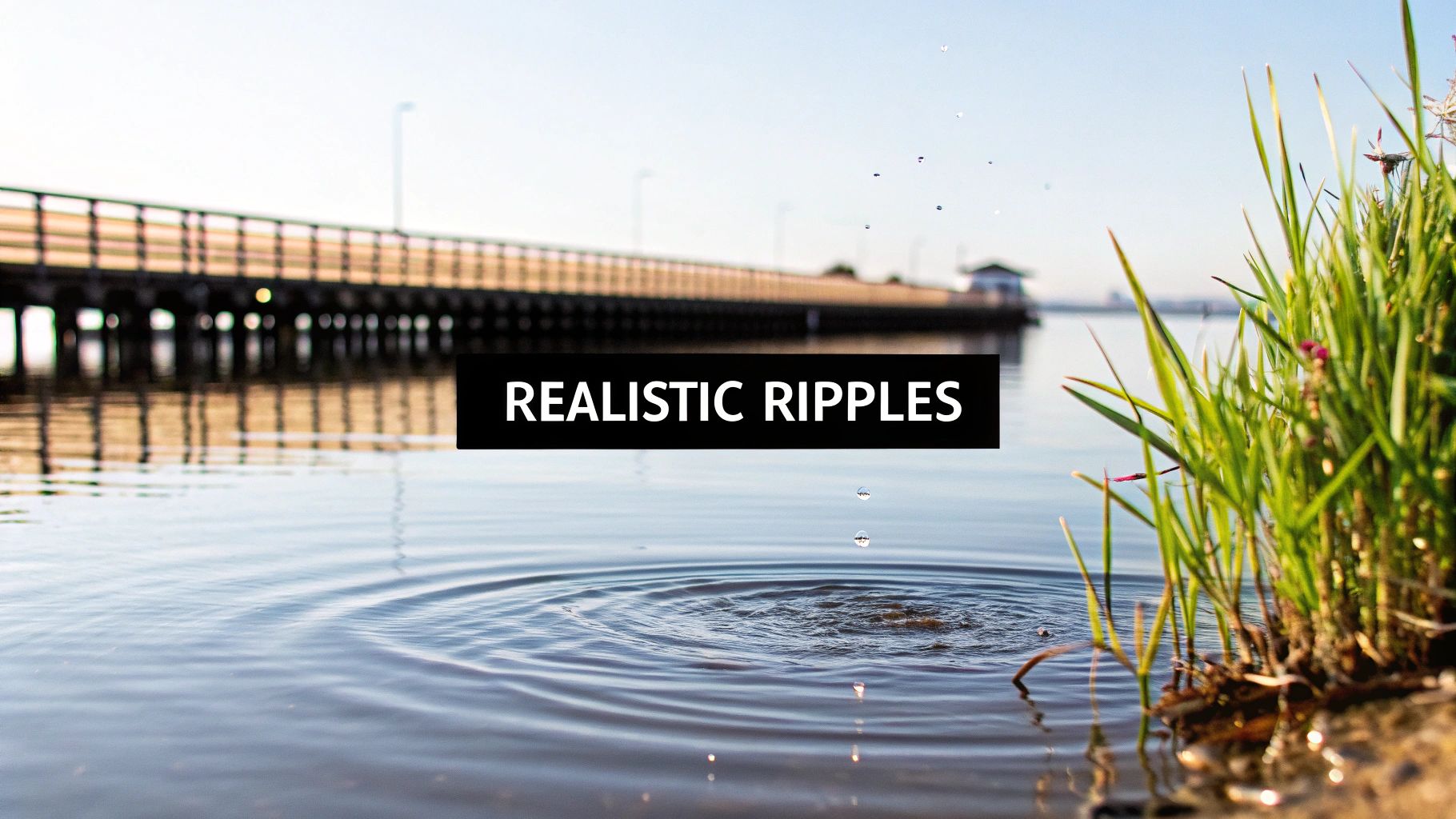
The foundational layers set the mood for your water scene, but it's the final, delicate details that truly make it breathe. This is where we shift from broad reflections to the specific textures and highlights that convince the eye it's looking at real, moving water. It’s all about observation and a light touch.
Think about the difference between the reflection of a solid object versus soft foliage. A pier or a boat, for instance, will cast sharper, more defined lines, even when those lines are broken by ripples. The reflection of trees or clouds, on the other hand, will have much softer, more diffuse edges that almost melt into the water’s surface. Capturing this distinction is key.
Crafting Believable Ripples
Ripples are the visual language of water in motion. They catch light, distort reflections, and signal the energy of the scene. Without them, even a beautifully colored reflection can feel dead and glassy. The secret to painting convincing ripples is to think in terms of intersecting lines and broken color.
For this, a rigger brush is one of the best tools you can have. Its long, thin bristles hold a surprising amount of fluid paint, letting you pull fine, elegant lines in a single motion. Load your rigger with a paint that's a slightly darker or lighter value than the surrounding water, then draw delicate, curved lines across the surface. Let them intersect and overlap to build up a sense of complex movement.
Another great method, especially with acrylics, involves a bit of wet-on-wet blending. While an area of water is still wet, add a small touch of a contrasting color—maybe a dark tone from a reflected object—and use a clean, soft brush to gently pull it horizontally. This creates a subtle, blurred distortion that perfectly suggests a gentle, rolling surface.
The most convincing ripples aren't uniform. You need variety. Change up their thickness, length, and direction. Some should be sharp and distinct, while others are soft and barely there. This mix is what creates a truly natural effect.
Capturing Brilliant Highlights and Sparkles
Highlights are the last touch of magic—those small, bright sparkles of light that dance on the water. They should be the very last thing you add, and you need to be restrained. Piling on too many highlights can make a painting look busy and artificial, but too few will leave it feeling flat. Your goal is to place them strategically where the sun would naturally kiss the peaks of tiny waves and ripples.
For acrylic painters, opaque titanium white is your go-to. Use a small, pointed brush to apply tiny, decisive dots and short dashes of pure white.
If you're working with watercolor, the most brilliant highlights come from the paper itself. The best way to achieve this is by applying masking fluid to the spots you want to keep bright before you lay down your washes. Once the painting is completely dry, you just rub off the masking fluid to reveal the crisp, sparkling white of the paper underneath.
Mastering these details connects you to a long history of artistic innovation. Perspective systems developed as early as 1425 fundamentally changed how artists depicted water. Atmospheric perspective, for instance, can fade distant reflections by as much as 40% in hue saturation, a vital technique for creating depth in seascapes. Modern artists can achieve a similar feel by reserving 25% of their canvas as negative space, then layering watercolor wet-into-wet and diluting pigment by 60% for that classic shimmer.
This skill has become increasingly valued; ocean-themed originals saw a 28% rise in value at Christie's from 2019-2024, and 62% of interior designers now specify reflective water art for homes. The Tate even offers fascinating research into how artists have approached the changing surfaces of paintings with the Tate.
The interplay between light, shadow, and reflection is a deep well of inspiration. Learning to properly mix your colors to capture these subtle shifts is a skill that grows with every painting. For more on this, our articles on the nuances of color mixing can offer deeper guidance. By combining these final details with thoughtful color choices, your painting will not only look real but will also carry a powerful emotional weight.
7. Troubleshooting Common Painting Challenges
Even the most seasoned artist hits a wall now and then. Painting water reflections comes with its own unique set of challenges, and it's easy to get frustrated. But remember, every hurdle is just a disguised learning opportunity that builds both your skill and your confidence.
Let's walk through some of the most common issues I see and, more importantly, how to fix them.
One of the biggest culprits is creating muddy colors. This usually happens from a bit of over-enthusiasm with blending, especially when working wet-into-wet. If you mix colors too much right on the canvas or paper, they lose their individual character and collapse into a dull, brownish mess.
The simplest fix is patience. Let your layers dry completely before adding new ones. This wet-over-dry technique gives you far more control. You can also try laying distinct strokes of color next to each other, allowing the viewer's eye to blend them optically from a distance.
Solving Reflections That Look Too Solid
Does your reflection look like a sticker slapped onto the water? This is a classic problem, and it almost always comes down to two things: hard edges and incorrect values. Real water is never perfectly still; its constant, subtle motion naturally softens and distorts the edges of a reflection.
To fix this, take a soft, clean, slightly damp brush and gently feather the edges of your reflection. You want to blur it just enough to integrate it with the surrounding water. Next, check your values. A reflection should be darker and less vibrant than the actual object it’s mirroring. Just by toning down the intensity, you can make it recede and feel far more believable.
A reflection should always be secondary to the object itself. Its purpose is to support the main subject, not compete with it. By softening its edges and muting its colors, you ensure it stays in its proper place within the composition.
Correcting Flat Water and Unnatural Ripples
If your water feels lifeless or lacks depth, the issue is almost certainly a lack of value variation. Painting the entire surface with one flat color will never look convincing. Think about how real water has subtle shifts—darker tones in the foreground, with lighter, less detailed areas further away.
Start by introducing a wider range of darks and lights to create that illusion of depth. A few well-placed ripples are also perfect for breaking up a monotonous surface. Just make sure your ripples follow the rules of perspective: they should be larger and more detailed up close, becoming finer and less distinct as they recede into the distance. Avoid making them all identical; nature loves variety, and so should your painting.
Common Questions on Painting Reflections
When you're first tackling water reflections, a few common questions always seem to pop up. Think of this as a chat with a fellow painter who’s been there—these are the quick, practical answers I've found that solve the most frequent sticking points.
Why Does My Reflected Sky Look Darker Than The Real Sky?
This is a classic observation, and the physics behind it is pretty simple. Water isn't a perfect mirror; it actually absorbs some of the light that hits it. Because of this, it reflects less light back to your eye than the sky does directly. The result? The reflection's value is almost always a step darker.
Here's a reliable rule of thumb: mix your main sky color, then add just a touch of a darker, more neutral tone for the reflection. A muted purple or a soft gray often does the trick. This small adjustment makes a world of difference in creating a believable effect.
How Do I Make Reflections Look Like They're on Moving Water?
The key is to break up the image. If you paint a perfect, static mirror image, the water will look like glass. To create that sense of movement, you need to suggest a fluid, shifting surface.
- Use long, horizontal brushstrokes to gently stretch and distort the reflected shapes.
- Interrupt any crisp lines with small, broken strokes using colors from the surrounding water.
- Most importantly, you have to soften the edges. The reflection should blend subtly into the water, not sit on top of it like a sticker.
It's this combination of distorted shapes and soft edges that truly sells the illusion of moving water.
What’s The Best Way To Paint Sparkling Highlights on Water?
How you approach this depends entirely on your medium, as acrylic and watercolor demand different strategies.
For acrylics, the most direct method is to wait until the very end. Use a small, pointed brush with a dab of opaque titanium white and carefully place your highlights where the light would catch the very peaks of the ripples. Less is more here.
For watercolor, the trick is to plan ahead. You have to preserve the white of the paper. Before you even start your first wash, apply masking fluid where you want your brightest sparkles. Once all your paint layers are completely dry, gently rub off the mask. You'll be left with crisp, brilliant highlights that have a brightness you just can't get by painting over a colored wash.
At Skyler's Art, every piece I create is an exploration of the emotional power of light and water. If you'd like to see these principles in action, I invite you to browse the gallery and find an original painting that speaks to you.
Article created using Outrank