A Guide to Impressionistic Painting Techniques
Impressionistic painting is less about creating a perfect, photographic copy of a scene and more about bottling the feeling of a moment. It's an art form built on visible brushstrokes, pure color, and a deep appreciation for the way light can transform an ordinary view into something magical. The goal is to give the viewer a vibrant, immediate sensation—an emotional response, not just a documentation of reality.
Embracing the Impressionist Mindset
Before you even pick up a brush, the most important step is to shift your perspective. To paint like an Impressionist, you have to learn to see like one. This means letting go of the need to render every tiny detail and, instead, focusing on the overall sensory experience of the scene in front of you.
Don't think about painting a tree. Instead, think about painting the way sunlight dapples through its leaves on a breezy afternoon. This approach is all about working quickly and intuitively, capturing those fleeting moments before the light changes and they're gone forever. The aim here is expression, not perfection.
The Philosophy of the Fleeting Moment
The Impressionist movement was born out of a rebellion against the stuffy, hyper-realistic art of the French academies. Back in the 1860s, Parisian artists like Claude Monet and Pierre-Auguste Renoir started painting modern life as they actually experienced it—raw and immediate. They used short, thick brushstrokes and often placed unblended colors side-by-side to capture the essence of a moment. While the critics of the day were scandalized, these artists completely redefined the art world. You can read more about this historic shift in painting over at JacksonsArt.com.
At its core, Impressionism is about seeing the world not as a collection of static objects, but as a dynamic interplay of light, color, and atmosphere. It’s an invitation to paint what you feel, not just what you see.
This perspective turns the world into a constant source of inspiration. A simple seascape becomes a fascinating study of shimmering reflections. A quiet field offers a chance to explore the subtle, gorgeous color shifts at dusk. This is the artistic philosophy that drives my own work, which you can read more about in my artist's journey. When you truly embrace this way of thinking, you unlock the ability to create art that feels alive, energetic, and uniquely your own.
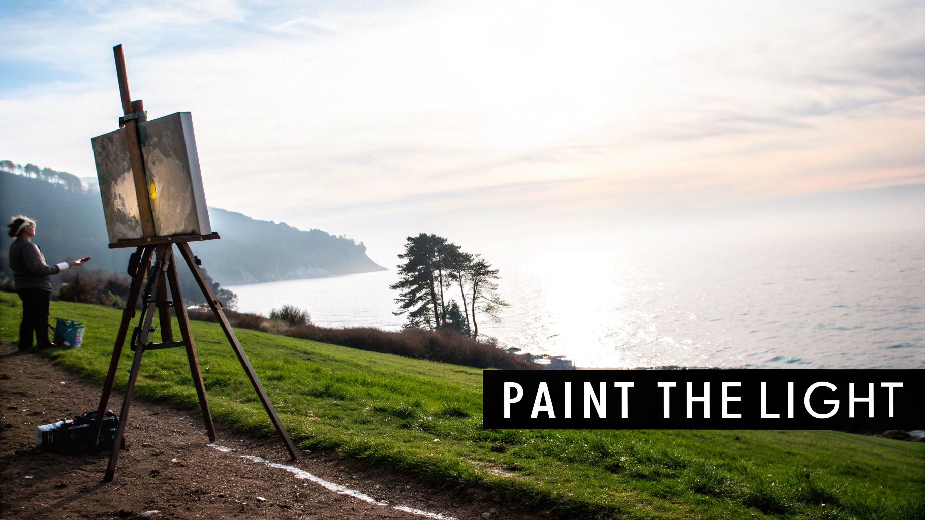
Setting Up Your Impressionist Studio
To paint with the spontaneity that Impressionism demands, you need a workspace that's ready when inspiration strikes. An organized, inviting studio means your tools are always within arm's reach, letting you capture a fleeting moment of light before it disappears. Whether you're painting indoors or heading outside en plein air, a thoughtful setup is your true starting point.
This preparation begins with your brushes. Impressionism is defined by its visible, energetic brushwork, so the tools you choose are more than just applicators—they're your primary mark-making instruments.
- Flat and Bright Brushes: These are your workhorses for creating the broad, confident strokes that define an Impressionist landscape. You can also turn them on their side for sharp, clean lines.
- Filbert Brushes: With their rounded tips, filberts are perfect for softer, more organic shapes. Think dappled light filtering through leaves or the soft edges of a cloud.
- Hog Bristle Brushes: If you’re working with acrylics, these are a must. Their stiff bristles grab onto thick paint, letting you build up that delicious texture and impasto.
The idea isn’t to have hundreds of brushes, but a small, versatile set you know inside and out. This familiarity allows you to work instinctively, without breaking your creative flow.
Curating Your Color Palette
The Impressionists famously ditched the muddy, dark palettes of the academic tradition in favor of pure, vibrant color. A key part of this was avoiding pure black, a pigment they observed rarely exists in the natural world. Instead, they mixed their own deep, lively darks from complementary colors—think ultramarine blue and burnt sienna—to create shadows that felt full of light and air.
The real secret to the Impressionist palette is color harmony. By intentionally limiting yourself to a handful of essential pigments, you become a far more adept color mixer. This restraint is what gives the final painting its unified, luminous quality.
A fantastic starting point is to select a warm and a cool version of each primary color, plus a good white. This simple setup is less intimidating and forces you to mix colors thoughtfully rather than just squeezing them straight from a tube. For a look at how this philosophy plays out in finished pieces, you can see examples in the Skyler's Art online shop.
Choosing the right pigments is crucial for achieving clean, brilliant mixes. While personal preference plays a role, certain colors are renowned for their utility in an Impressionist-style palette.
Essential Impressionist Palette for Acrylics and Watercolors
| Pigment | Acrylic Recommendation | Watercolor Recommendation | Notes on Usage |
|---|---|---|---|
| Titanium White | Heavy Body Titanium White | Chinese White or Titanium White Gouache | The core of your palette for lightening colors and creating opaque highlights. |
| Cadmium Yellow Light | Cadmium-Free Yellow Light | Lemon Yellow or Hansa Yellow Light | A cool, bright yellow perfect for sunlit skies and creating clean greens. |
| Cadmium Red Light | Cadmium-Free Red Light | Pyrrol Scarlet or Cadmium Red | A warm, powerful red for adding vibrant warmth to your landscapes. |
| Alizarin Crimson | Quinacridone Magenta | Permanent Alizarin Crimson or Quinacridone Rose | A cool red essential for mixing violets, deep reds, and nuanced darks. |
| Ultramarine Blue | Ultramarine Blue (Green Shade) | French Ultramarine | Your go-to warm blue. Mixes beautifully for skies, water, and rich shadows. |
| Cerulean Blue | Cerulean Blue Hue | Cerulean Blue | A cool, granulating blue that's wonderful for atmospheric skies and distant hills. |
| Burnt Sienna | Burnt Sienna | Burnt Sienna | A versatile earth tone for creating natural greens, warm neutrals, and rich darks when mixed with blue. |
This curated list provides a strong foundation, encouraging you to explore the vast range of colors you can create through mixing rather than relying on dozens of pre-mixed tubes.
Preparing Your Painting Surface
Another trick of the trade is to work on a toned ground. Staring at a brilliant white canvas can be intimidating, and it makes judging your colors and values incredibly difficult. Before you even begin painting, apply a thin, neutral wash of a color like a light gray or a warm yellow ochre.
This simple act provides a harmonious mid-tone that ties the whole composition together. From your very first brushstroke, your colors will appear more vibrant and cohesive against this prepared surface.
This infographic breaks down the core mindset you'll need to adopt as you apply these techniques.
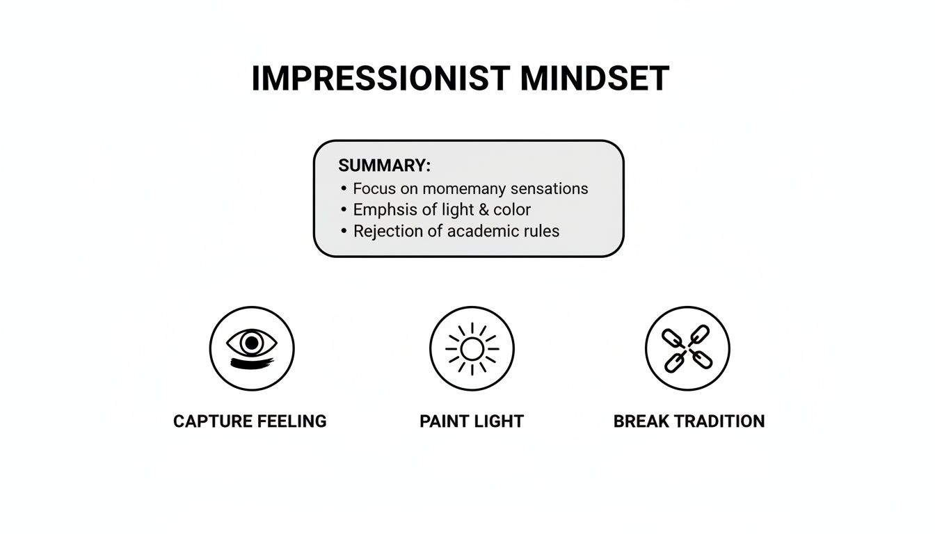
It’s a great reminder that capturing a feeling, painting the light itself, and being willing to break from tradition are the pillars that hold up all the practical methods we've discussed.
Mastering Expressive Brushwork and Color
The real soul of an impressionistic painting isn't found in the subject itself, but in the energy of how the paint is applied. It’s all about the dance between expressive brushwork and an intelligent, almost intuitive, use of color. To truly capture this style, you have to let go of the instinct to blend everything smoothly. Instead, you need to embrace the power of distinct, confident marks that build form and atmosphere at the same time.
This starts with seeing your brush as more than a simple tool for filling in shapes. Every single stroke should have a purpose—to hint at texture, suggest a gust of wind, or describe how light is falling on a surface. Get comfortable loading your brush with plenty of paint and experimenting with different kinds of pressure and direction.
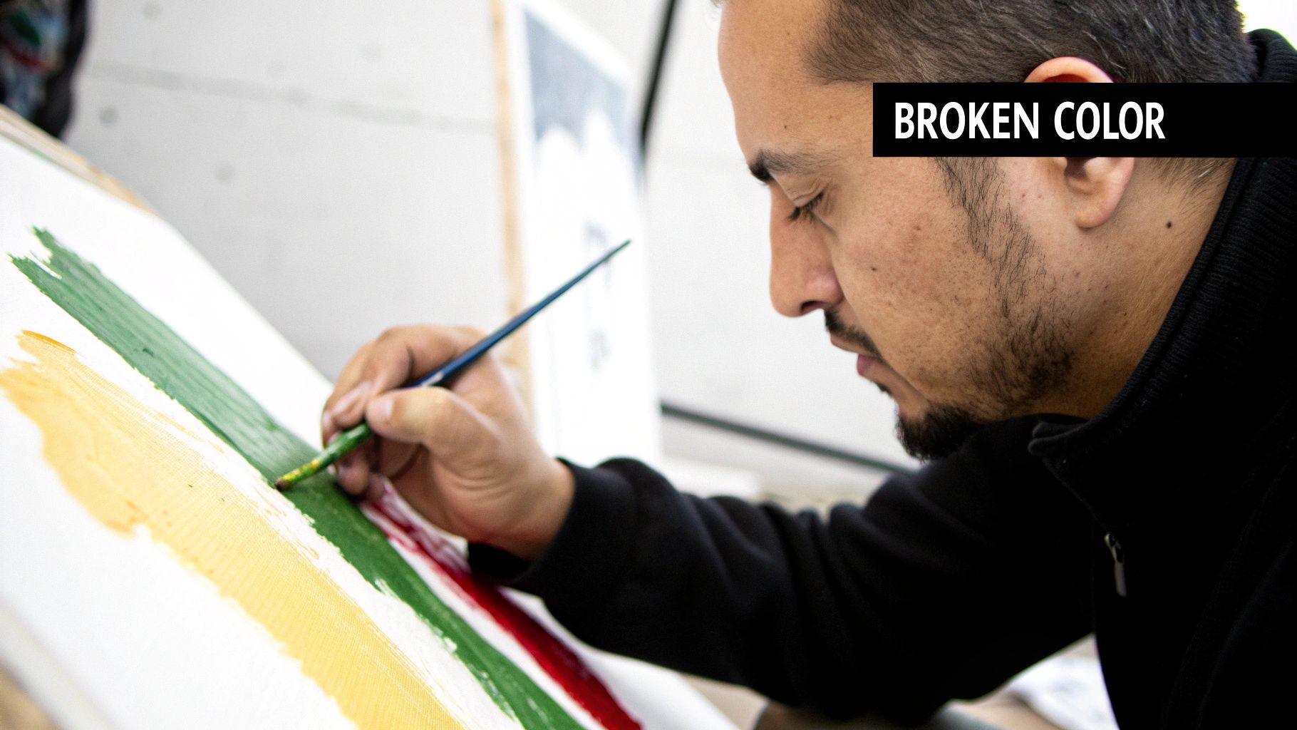
The Power of Broken Color
One of the most essential impressionistic painting techniques is what’s known as broken color. The idea is simple but the effect is profound: you place small, unblended dabs of pure color right next to each other on the canvas. So, instead of mixing the perfect green for a leaf on your palette, you might apply separate strokes of blue, yellow, and maybe even a surprising touch of red.
From a few feet back, the viewer’s eye does the mixing for you. It optically blends these separate hues into a single, vibrant color that seems to shimmer with life. The result is far more dynamic than a flat, pre-mixed color could ever be. It’s this optical vibration that gives impressionist works their signature luminous quality, making the canvas feel alive.
This was a radical departure from the smoothly glazed surfaces that Renaissance masters perfected. The Impressionists used opaque paint and specific color pairings to amplify vibrancy. Modern optical studies have actually confirmed their instincts, showing that placing complementary colors like blue and orange next to each other can increase their perceived brightness by as much as 40%. Fueled by newly available synthetic pigments, by 1874 their palettes were ablaze with intensely bright hues. You can read more about Impressionism's history and see just how revolutionary this approach was.
Developing a Vocabulary of Brushstrokes
Think of your brushwork as your unique handwriting. Just as different lettering styles convey different tones, the marks you make on the canvas communicate specific feelings and textures. Building a diverse vocabulary of strokes is absolutely essential.
Here are a few to get you started:
- Short, Choppy Dabs: Use the tip of a flat or bright brush for this. It’s perfect for creating textured areas like dense foliage, choppy water, or grassy fields. These marks build a wonderfully tactile surface.
- Long, Sweeping Strokes: Here, you’ll use the full length of the bristles to convey movement and direction. This is your go-to for flowing water, wind-swept clouds, or the gentle curve of a distant hill.
- Scumbling and Dry Brushing: With a nearly dry brush and just a small amount of thick paint, you can drag color lightly over a textured or previously painted surface. This technique is fantastic for creating atmospheric effects like mist or the sparkle of sunlight on water.
Think of each brushstroke as a word in a sentence. Individually, they are simple marks. But when placed together with intention, they form a cohesive and expressive narrative that tells the story of a specific moment in time.
A Practical Exercise in Color and Light
To really get a feel for these ideas, try this simple but incredibly effective exercise. Pick a single, well-lit object—a piece of fruit on a windowsill is perfect. Now, forget about painting its "actual" color and focus only on the light and shadow.
- Identify the Light Source: First, figure out where the light is coming from. Where are the brightest spots on the object?
- Paint the Light: Using warm colors like yellow, orange, and white, apply thick, distinct dabs of paint to these highlighted areas. Don't blend them.
- Paint the Shadow: Now, look closely at the shadows. Resist the urge to reach for gray or black. Instead, paint the shadows with the object’s complementary color. For a yellow lemon, for instance, its shadows would be built from individual strokes of violet, blue, and deep purple.
This exercise forces you to see the world in terms of color temperature and light, not just objects. It's a foundational skill in impressionistic painting that trains your eye to find the hidden colors all around you, completely transforming how you approach the canvas.
Composing with Light and Atmosphere
Once you get past the mechanics of brushwork and color mixing, you arrive at the real soul of impressionistic painting: composing with light itself. At its core, Impressionism is the art of painting the atmosphere—capturing the intangible mood, the temperature, and the fleeting quality of a single moment in time. The focus shifts away from rendering objects with perfect precision and toward portraying the effect of light as it falls upon them.
To do this well, you have to learn to simplify what you see. Instead of a complex seascape with a dozen different elements, train your eye to see large, abstract shapes of light and shadow. Squinting is a classic artist's trick for a good reason; it blurs out all the fussy details and immediately reveals the foundational value structure of the scene. This practice is essential for translating what’s in front of you into its most basic elements of form and color.
Framing a Spontaneous Moment
Traditional composition often leans on balanced, centered subjects, but the Impressionists broke from that mold. They were heavily inspired by the brand-new art of photography and the distinct aesthetic of Japanese woodblock prints, which led them to embrace unconventional framing to create a sense of immediacy. They knew that a perfectly centered subject often feels static and staged.
To bring that "snapshot in time" feeling into your own work, try thinking about composition differently:
- Asymmetrical Layouts: Resist the urge to place your main subject dead center. Pushing it to one side creates a more dynamic path for the viewer's eye to follow as it moves through the painting.
- Unusual Cropping: Don't feel obligated to fit everything neatly inside the canvas. Cropping a subject in an unexpected way—a boat that’s only partially in the frame, for instance—suggests that the world continues beyond the edges, making the scene feel more authentic and less posed.
This approach transforms the viewer from a passive observer into an active participant, pulling them right into the moment you've decided to capture.
The goal isn't just to paint a pretty picture; it's to convey a genuine sensation. An off-center composition or a cropped subject can make a quiet scene, like in my piece A Pier of Light, feel more like a personal, fleeting memory rather than a formal landscape.
Painting the Effect of Light
Impressionism is built on a deep, almost obsessive fascination with the dance of light—how it shifts and transforms in a matter of seconds. Monet famously embodied this when he painted his Rouen Cathedral series more than 30 times between 1892 and 1894, with each canvas capturing a different time of day under different atmospheric conditions. By the 1880s, artists were moving away from traditional reddish-brown grounds to lighter grays and even stark whites to make their vibrant colors truly sing.
A key "rule" was the complete elimination of black paint from the palette. Shadows were instead constructed from rich, complementary color mixes. Pairings like blue and orange accounted for over 70% of depth effects in many impressionistic works. You can discover more insights about Impressionism's evolution at The Art Story.
What this all means is that your primary subject isn't the ocean, the field, or the figure. It's the light. To get into this mindset, constantly ask yourself questions as you paint. Is the light warm and golden, or is it cool and crisp? Are the edges of the shadows sharp and defined, or are they soft and hazy? Answering these questions with your brush is how you begin to paint the atmosphere and capture a mood, not just a likeness.
Avoiding Common Painting Pitfalls
Every artist hits a wall now and then, no matter how long they’ve been painting. When you’re first diving into impressionistic techniques, a few familiar challenges tend to pop up again and again. Learning to spot these common traps is the first real step toward painting with more confidence and intuition.
The goal isn't to be perfect, but to learn how to see a problem and work your way through it. This is how you build resilience and find your own voice. For most beginners, the biggest hurdles are muddy colors, losing that initial burst of light, and compositions that just feel a bit stiff. Thankfully, a few small adjustments can make a world of difference.
The Problem of Muddy Colors
It’s one of the most common frustrations in painting: you aim for vibrant, sun-drenched color and end up with something dull and muddy. This almost always comes down to one thing: over-blending.
Impressionism is all about optical mixing, where the viewer's eye does the work of blending distinct dabs of color from a distance. It's not about physically mixing pigments on the canvas until you have a flat, uniform tone. When you keep fussing with an area, scrubbing the brush back and forth, you’re literally mixing the life right out of your colors.
- The Solution: Make a mark and leave it. Have faith that those separate little strokes of yellow and blue will read as a brilliant green when seen from a few feet away. If a color just isn't working, it's almost always better to let it dry, scrape it off, or simply paint over it with a fresh, clean stroke. Don't try to "fix" it by blending it more.
Losing the Sense of Light
It’s so easy to get caught up in painting a tree or a wave that you forget what your real subject is: the light. A painting that starts out with the strong feeling of a sunlit afternoon can go flat in a heartbeat if you lose track of where your light is coming from and where the shadows should fall.
This happens when we stop seeing shapes of light and dark and start painting "things."
My best advice is to step back from your canvas constantly—every few minutes, if you can. Looking at your work from ten feet away gives you the distance you need to see the whole picture. You can immediately spot if your values are holding together or if you're getting lost in the weeds.
This simple habit forces you to keep the big picture in mind. It helps you protect that atmospheric quality that makes an impressionistic painting feel alive.
Creating Static Compositions
Another classic pitfall is a painting that feels rigid and staged. This often happens when the main subject is dead-center, or when every single element is rendered with the same level of detail. That spontaneous, fleeting moment—that "snapshot" feeling—is lost when a composition is too perfect or overworked.
To fix this, think in terms of asymmetry and suggestion. Let some edges be soft and blurry while others are sharp and defined. By varying your focus and allowing parts of the scene to remain loosely painted, you invite the viewer to participate, to fill in the gaps themselves. This makes the entire experience more dynamic and engaging. It’s a core principle of good impressionistic work.
Finishing and Presenting Your Artwork
That final brushstroke feels incredible, but the journey isn't quite over. How you finish and present your piece is what bridges the gap between your studio and your audience, giving your impressionistic work the professional polish it deserves.
These last steps are crucial for protecting your art and showcasing its true character.
Protecting Your Finished Painting
For acrylics, a final varnish is non-negotiable. This is what truly makes the colors pop, saturating them to appear richer and deeper than they do when dry. More importantly, varnish provides an essential layer of protection against dust, grime, and the damaging effects of UV light over time.
Watercolors, by their very nature, are more delicate. They need a different kind of care. The best approach is to have them professionally matted and framed under protective glass, which guards the paper against moisture and environmental damage. This also gives the work the formal, gallery-ready presentation it warrants.
Photographing Your Work for an Online Audience
In today's world, a high-quality photograph is often the first—and sometimes only—way people will experience your art. Getting this right is an essential skill, especially since capturing the subtle textures and color shifts in an impressionistic piece can be tricky.
The secret is soft, natural light. Try shooting indoors near a large window on a slightly overcast day. This diffuse lighting is your best friend—it minimizes glare and avoids the harsh shadows that can kill the mood of a painting. It allows the viewer to see all the nuanced brushwork you spent so much time on.
A common mistake is shooting under standard indoor lights. They almost always cast a yellow hue and create distracting hotspots and reflections on the paint's surface. Natural light is honest; it reveals your painting's true character.
Writing Compelling Artwork Descriptions
Once you have a fantastic photo, the description is your chance to invite the viewer into the story behind the art. Don't just list the size and medium. This is where you connect with your audience. Share what inspired you or the specific feeling you were chasing.
When writing your description, think about including:
- Mood and Atmosphere: Was it a calm, misty morning by the coast? Or a vibrant, sun-drenched afternoon in a field of flowers? Use evocative words to set the scene.
- Technique Highlights: Briefly mention a key technique you were excited about. Did you use broken color to capture the shimmering light, or particularly expressive brushstrokes to define the waves?
- Personal Connection: Explain what this scene or subject means to you personally. That connection is contagious.
A strong narrative transforms a simple image into a meaningful experience. If you're looking for inspiration, take a look at the descriptions in the Skyler’s Art online gallery. Storytelling helps your art resonate on a much deeper level with potential collectors and admirers.
Answering Common Questions
Should I Use Black Paint in Impressionistic Painting?
This is a classic question, and for good reason. Traditionally, the Impressionist masters steered clear of pure black paint from a tube. They observed that true black rarely appears in nature; even the deepest shadows are filled with reflected light and subtle color.
Instead of reaching for black, they created their darks by mixing complementary colors. Think of combining a deep ultramarine blue with a rich burnt sienna. This technique produces darks that are far more vibrant and alive, harmonizing beautifully with the rest of your color palette and adding a sense of atmospheric depth that a flat black just can't match.
How Can I Stop My Colors from Turning to Mud?
Ah, the dreaded "mud." It's something every painter struggles with, and it usually happens from over-blending colors directly on the canvas. The key to avoiding it lies in a core Impressionist technique called broken color.
Rather than mixing everything into a uniform tone, you place distinct dabs of pure color next to each other. Let the viewer's eye do the work of blending them from a distance. A few practical tips can make all the difference:
- Use a clean brush for each new color family.
- Allow layers to at least partially dry before adding more paint on top.
- Focus on "optical mixing" (the eye blends it) rather than "physical mixing" (you blend it).
For a deeper dive into this and other artistic philosophies, you can explore some of the insights from Skyler's creative journey.
What's the Ideal Surface for Impressionistic Painting?
The surface you choose can dramatically affect the outcome. For acrylics, I almost always recommend a canvas that has a bit of texture, or "tooth." This texture is brilliant for grabbing thicker applications of paint and really showing off that expressive, energetic brushwork we're aiming for.
When working with watercolors, the paper is everything. You'll want a high-quality, cold-press watercolor paper that is 140 lb or heavier. This weight prevents the paper from buckling when wet and provides a wonderful surface for capturing the luminous, transparent quality of the medium.
Article created using Outrank