How to Create Texture in Paintings a Guide for Artists
When we talk about creating texture in a painting, we're really talking about giving a flat canvas a physical, three-dimensional quality. This isn't just an illusion; you can build actual depth by applying thick paint (impasto), scratching into wet layers (sgraffito), or even mixing things like sand or gel mediums directly into your pigments.
Why Texture Is a Painter's Secret Weapon
Texture is what elevates a painting from something you just see to something you can almost feel. It’s the secret ingredient that can transform a two-dimensional surface into a living, breathing experience, conveying anything from the raw energy of crashing waves to the quiet stillness of a glassy lake. In many ways, it's a core part of artistic storytelling.
This focus on surface quality isn't new. The role of texture in creating visual depth stretches back through art history, even to prehistoric cave paintings where it was a fundamental part of expression. Think of the Old Masters like Rembrandt; the slow-drying nature of oil paints gave them the freedom to build up rich, layered surfaces that added incredible emotional weight to their work.
Guiding the Viewer's Eye
Texture, when used strategically, becomes a powerful tool for directing attention. A heavily textured area will always command more notice than a smoother one, creating a natural focal point through contrast. This is a go-to technique in both landscape and abstract painting to guide the viewer through the composition.
Texture is the visual equivalent of a whisper or a shout. A smooth, glazed surface might suggest tranquility, while a rough, impasto passage can convey intense emotion or raw energy. It’s a direct line to the viewer’s feelings.
Evoking Emotion and Atmosphere
Beyond just guiding the eye, texture is a master of mood. Imagine the difference between a soft, scumbled cloud and a sharp, jagged rock formation carved out with a palette knife. Each of those surfaces tells a completely different story and pulls a unique emotional response from the viewer.
Artists have long understood this connection:
- The Impressionists used visible, textured brushwork to capture the fleeting dance of light and movement. For a deeper dive, check out our guide to impressionistic painting techniques.
- Abstract Expressionists built up dramatic layers of paint to express raw, unfiltered emotion.
- Many contemporary artists push boundaries by mixing unconventional materials into their paint, developing their own unique textural languages.
Grasping this foundational role is the first real step. Once you understand why texture matters, you can start mastering how to use it to bring profound depth and an immersive quality to your own art.
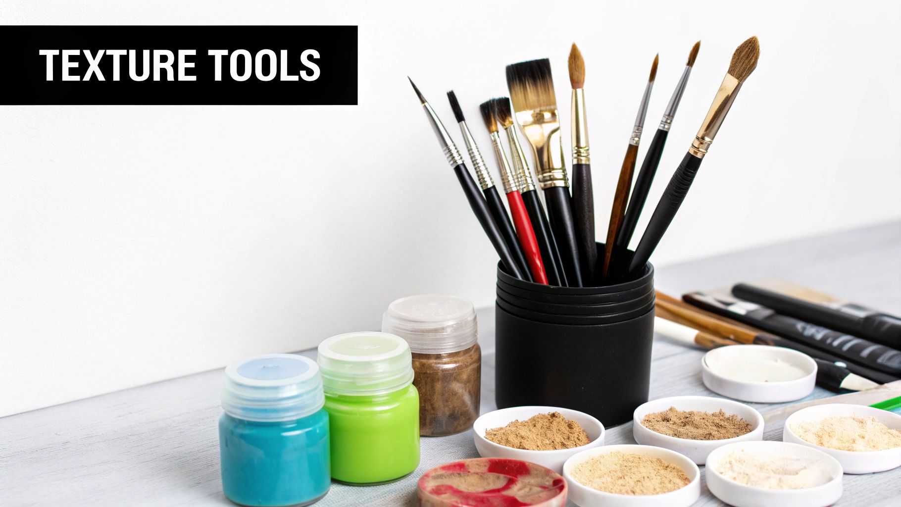
Gathering Your Texture Toolkit
To build captivating surfaces in your art, you'll need the right tools. Think of this less as a shopping list and more as building an arsenal. The choices you make before paint even touches the canvas directly influence the final feel and emotional weight of your work. Every tool has its own voice.
This starts with the fundamentals: brushes and palette knives. A stiff-bristled brush, for instance, is my go-to for scruffy, weathered effects. On the other hand, a soft synthetic brush is what you want for smooth, subtle gradations. Choosing the right brush gives you control over the character of your marks right from the start.
Palette knives are no different. A long, flexible knife can sweep paint across the canvas to create soft, blended areas, while a small, diamond-tipped knife lets you carve out sharp, sculptural marks that stand right off the surface. Each tool offers a different physical dialogue with the paint.
Essential Tools for Building Texture
You don't need every tool at once, but having a few core items will open up a world of possibilities. Building a versatile collection is the key to exploring all the ways you can create physical depth.
- Palette Knives: These are indispensable for applying thick, buttery paint in a way brushes simply can't. They create the sharp edges and sculptural forms essential for impasto.
- Stiff-Bristled Brushes: You'll need these for techniques like dry brushing and scumbling. They leave behind a beautifully rugged and broken application of color that I love for landscape work.
- Sponges and Rags: A natural sea sponge can produce incredibly organic, mottled effects. Rags are fantastic for lifting paint or dabbing on soft, blended textures.
- Specialty Texture Combs: These tools have teeth of varying sizes, allowing you to drag them through wet paint to create deliberate grooves, lines, and patterns.
To help you decide what to grab first, here’s a quick breakdown of common tools and what they actually do.
Texturizing Tools and Their Effects
| Tool | Primary Use | Resulting Texture Effect | Best For |
|---|---|---|---|
| Palette Knife | Applying thick paint, scraping, carving | Sharp edges, flat planes, heavy impasto, sculptural marks | Mountains, rocks, architectural details |
| Stiff Hog Bristle | Dry brushing, scumbling, aggressive mark-making | Gritty, broken color, visible brushstrokes, weathered look | Tree bark, weathered wood, rough seas |
| Sea Sponge | Dabbing and lifting paint | Organic, mottled, porous, unpredictable patterns | Foliage, clouds, abstract backgrounds |
| Rags/Cloths | Blending, wiping away, applying soft color | Soft, diffused textures, subtle gradations | Skies, atmospheric effects, smooth surfaces |
This table is just a starting point. The real magic happens when you start combining these tools and techniques in your own unique way.
Additive Mediums and Unconventional Materials
Beyond your standard tools, mixing mediums and other materials directly into your paint can produce truly unique results. Additive mediums are specifically designed to alter the consistency and body of your paint, giving you much more control over its physical properties.
Understanding the function of each medium is crucial. A modeling paste creates an opaque, heavy body, while a gel medium offers translucent layers. This choice alone can dictate whether a texture feels solid and earthy or light and airy.
Consider adding these powerful materials to your collection:
- Modeling Paste: This is a thick, opaque medium that holds stiff peaks beautifully and can even be carved into once it’s dry.
- Gel Mediums: Available in gloss, satin, or matte finishes, these increase transparency and extend your paint's volume without losing its body.
- Pumice Gels: These gels contain fine volcanic rock particles, creating a gritty, sandpaper-like surface that's incredible to the touch.
- Sand or Coffee Grounds: For a truly organic feel, try mixing these directly into your paint or gesso. It creates a genuinely tactile grit you can't get any other way.
By understanding what each tool and medium brings to the table, you can start making intentional choices that truly serve your artistic vision. If you're just getting started and want to build a solid foundation, take a look at our comprehensive guide on how to start painting with acrylics. It will ensure you have the basics covered before you begin experimenting with these more advanced textural elements.
Mastering Texture Techniques in Acrylics
If you're looking to build physical, touchable texture in your work, acrylics are a dream to work with. They dry quickly and play well with all sorts of mediums, which gives you the freedom to layer, sculpt, and even carve into your surfaces with a ton of confidence. The key to unlocking all that potential is getting a handle on a few core methods.
Three of the most impactful techniques I turn to again and again are Impasto, Dry Brushing, and Sgraffito. Each one manipulates the paint in a completely different way, bringing a unique character and depth to a piece. Once you move beyond just a flat application of color, your paintings really start to come alive.
Building Form with Impasto
Impasto is all about applying paint so thickly that every brushstroke or palette knife mark becomes part of the final piece. You’re not just blending color; you’re sculpting it. This method gives your work a genuine three-dimensional quality, creating peaks and valleys that catch the light and cast their own shadows.
For a really strong impasto effect, I almost always reach for a palette knife. It lets you scoop up a hefty amount of heavy body acrylic and lay it down with bold, decisive marks. The best way to think about it is like frosting a cake—the goal is to create defined, structural shapes that literally stand up from the canvas.
This isn’t some new-fangled idea, either. It really took hold during the Impressionist movement. A massive analysis of nearly 140,000 paintings showed that by the late 19th century, thick paint application was a go-to method for artists like Van Gogh to convey texture. You can explore more about these historical art findings on PNAS.org.
Creating Weathered Effects with Dry Brushing
Dry brushing is essentially the polar opposite of impasto. Instead of a loaded brush, you use just a tiny amount of paint on a stiff, dry brush. The trick is to have almost no moisture, which forces the pigment to catch only on the raised parts of your canvas texture or previous paint layers.
This technique is my secret weapon for suggesting rugged, weathered surfaces.
- Stone and Rock: I'll often drag a brush with a touch of gray or white over a dark base to get that perfect gritty texture of a cliffside.
- Tree Bark: A few short, vertical strokes with an almost-dry brush instantly mimics the rough, fragmented look of bark.
- Windswept Grass: Quick, upward flicks can create the illusion of dry, sparse blades of grass in a field.
What you're left with is a scratchy, broken layer of color that adds a real sense of age and history. It's a subtle effect, but it brings so much complexity to the painting.
Revealing Layers with Sgraffito
Sgraffito, which is just Italian for "to scratch," is a subtractive technique. You start by painting a layer of wet paint over a completely dry, contrasting color. Then, while that top layer is still wet, you use a sharp tool—the end of a brush handle, a palette knife edge, or a stylus—to scratch through it. This reveals the color hidden underneath.
This method is fantastic for creating fine details that would be difficult to paint directly, like individual blades of grass, strands of hair, or intricate patterns. It creates a dialogue between your layers, where what you take away is just as important as what you put down.
Once you feel comfortable with these foundational methods, you can start combining them. You could have a heavy impasto sky over a field detailed with sgraffito and dry-brushed rocks, for example. For more ideas, feel free to browse works that use these and other acrylic painting techniques in our gallery. The interplay between these different textures is what will give your work a rich, compelling surface that draws the viewer in.
Creating Subtle Textures with Watercolors
Working with watercolors is a completely different ballgame than using heavy-bodied acrylics. The magic here lies in subtlety and interaction. You’re not building up physical layers; instead, you’re using the medium's natural transparency to create depth and visual texture through delicate, layered washes.
It's really a dance between you, the water, and the pigment. The goal is to lean into the fluidity of the medium to build complexity, all without sacrificing that signature luminous, airy quality that makes watercolor so special.
Building Depth with Glazing and Scumbling
Glazing is a cornerstone technique for any watercolorist looking to build rich, complex color and a real sense of depth. It's simple in theory: you apply a very thin, transparent wash of color over a layer that is bone dry. But the results are profound. Each new glaze optically mixes with the one beneath it, creating a visual depth that a single, flat wash could never replicate. A thin glaze of ultramarine blue over a dry wash of quinacridone gold, for example, produces a far more vibrant and interesting green than one you could ever mix on the palette.
Scumbling, on the other hand, gives you a different kind of subtle texture. For this, you’ll use a semi-dry brush with just a tiny bit of pigment, lightly dragging it across the paper's surface. The paint will only catch on the raised "tooth" of the paper, leaving behind a broken, sparkling effect. It's perfect for suggesting shimmering light on water or the rough texture of distant stone. Mastering this is essential for seascapes, as we cover in our guide on how to paint water reflections.
Lifting Pigment for Soft Highlights
One of my favorite ways to create texture in watercolor is actually subtractive. Lifting is simply the process of removing wet or even dry pigment from the paper to create softer highlights or weathered patterns. This brings back the brightness of the paper in a much more organic and integrated way than relying solely on masking fluid.
You don't need fancy tools for this, either:
- Paper Towels and Tissues: Gently blotting a wet wash with a crumpled paper towel is my go-to for creating soft, cloud-like textures.
- Sponges: I love using a natural sea sponge, dabbed onto a damp wash. It lifts pigment in an irregular, porous pattern that’s unbeatable for foliage or the texture of distant hills.
- A Stiff, Damp Brush: After a layer has dried completely, you can re-wet a small area with a clean brush, gently "scrub" the pigment, and then dab it away with a cloth. This gives you much sharper, more defined highlights.
Lifting is a conversation with your painting. You're not just adding paint; you're taking it away to reveal light and form. This push-and-pull is what gives watercolor textures their signature delicacy and life.
Creating Unique Effects with Salt and Alcohol
If you want to introduce an element of chance and create truly organic textures, you can bring in a few household items. Sprinkling coarse salt onto a damp wash is a classic for a reason. As the paint dries, the salt crystals absorb the water and pigment around them, leaving behind these beautiful, starburst-like patterns. This effect is fantastic for creating frosty surfaces, sandy beaches, or interesting abstract backgrounds.
A similar thing happens when you drop a bit of rubbing alcohol into a wet wash. The alcohol pushes the pigment away, creating organic, blooming shapes. You get this intricate, web-like pattern that’s nearly impossible to paint by hand. It’s a wonderful way to add a touch of unpredictability and dynamic energy to your work.
Bringing a Textured Seascape to Life
Theory is one thing, but putting it into practice is where the real learning happens. Let's walk through a complete project, a textured seascape, from start to finish. We'll be layering several of the techniques we've discussed to show how they can work in harmony to build a single, compelling piece of art.
The journey from a blank canvas to a finished work is a deliberate one. It’s interesting to remember that the shift to canvas as a primary support, which really took off in 16th-century Venice, was a game-changer. It moved artists away from perfectly smooth wooden panels and opened the door for the kind of dynamic brushwork and impasto we're exploring today.
Setting the Foundational Grit
Every great painting needs a solid foundation. For a seascape, I want the surface itself to have a subtle, tactile quality—something that feels like a windswept beach before a single drop of paint is applied.
To get this effect, I’ll start by preparing the canvas not with standard gesso, but with a sandy gesso. You can find excellent pre-mixed versions, or you can easily make your own by adding a bit of fine-grain sand or pumice gel directly into your primer. I use a large brush or even a palette knife to spread it unevenly, creating thicker and thinner patches. This builds an organic, varied surface that will catch the light and interact beautifully with every layer of paint that follows.
Building the Sky and Sea
Once that gritty gesso is bone dry, it's time to block in the largest areas of the composition: the sky and the sea.
For the sky, I almost always turn to scumbling to create a soft, atmospheric feel. I'll take a stiff-bristled brush, load it with very little paint—a pale blue or a soft gray—and lightly drag it across the toothy surface. The paint just catches the high points of the sandy texture, leaving tiny gaps that give it a broken, airy quality.
Then, for the sea, I lay down a darker base color, something like a deep ultramarine blue mixed with a touch of burnt umber. This initial layer doesn't need to be perfectly smooth. In fact, some of that underlying brushwork will add to the final depth. If you want to dive deeper into getting water colors right, you can find more tips in my dedicated guide on painting seascapes with acrylics.
While we're focusing on acrylics here, it's worth seeing how texture is handled in other mediums. This visual guide shows a few core methods used in watercolor.
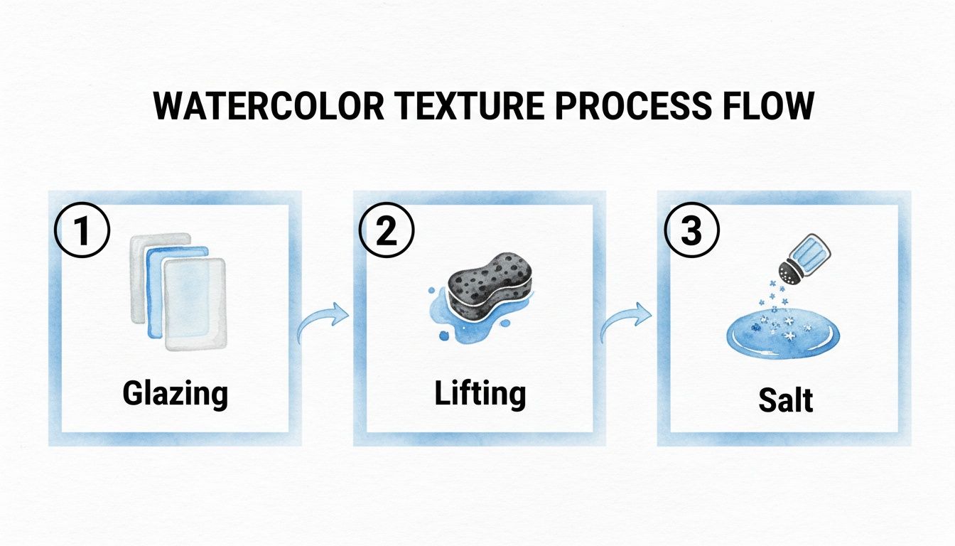
As you can see, glazing builds up transparent depth, lifting creates soft highlights, and adding salt results in those beautiful, crystalline patterns unique to watercolor.
Sculpting Waves and Shorelines
Now we get to the most exciting part—sculpting the waves. This is where I'll grab my palette knife. I load it up with thick, unthinned white paint, sometimes mixed with a bit of gel medium for extra body, and apply it in heavy impasto strokes to form the crests of the waves.
The knife is perfect for this. It lets you build sharp, energetic peaks that physically stand out from the canvas. These thick marks catch the light and cast real, tangible shadows, adding a whole new dimension to the work.
By varying the pressure and angle of the knife, you can create a sense of movement. A hard press creates a flat, powerful plane of foam, while a light touch with the knife’s edge creates delicate, breaking spray.
To hint at a distant, rocky shoreline, I’ll switch gears and use dry brushing. I’ll take a stiff brush with just a tiny amount of dark gray paint and drag it lightly across the horizon line. The bristles catch the raised grit from our sandy gesso, creating a rugged, weathered look that provides a fantastic contrast to the smoother sky.
Your Top Texture Questions, Answered
As you start working with texture, you're bound to run into a few hurdles. It’s all part of the process. I get asked these questions all the time, so I’ve put together some answers to help you navigate the most common challenges and work with more confidence.
Can I Mix Different Texture Mediums in One Painting?
Absolutely. In fact, combining different mediums is one of my favorite ways to create a really dynamic surface with lots of interest.
Imagine painting a coastline: you could use a gritty paste to capture the rough, sandy texture of the shore and then switch to a smooth modeling paste for the calm, distant sky. The key is simply to make sure the products you're using are compatible.
When you're working with acrylics, sticking to mediums from the same brand is your safest bet. This helps you avoid any weird chemical reactions that might cause the paint to peel or crack down the road. It's also critical to let each layer cure properly before you add another, especially if they have different drying times. A little patience here goes a long way in creating a stable, lasting piece of art.
Why Are My Impasto Textures Cracking as They Dry?
This is a classic problem, especially for those of us who love thick, chunky textures. Cracking almost always happens when paint is applied too thickly all at once. The top layer dries and shrinks faster than the paint underneath, which creates tension and, eventually, those frustrating cracks.
The best way to prevent this is to build up your texture in thinner layers, letting each one set up a bit before adding the next. An even better solution? Mix your paint with a dedicated impasto medium or modeling paste.
These additives are designed specifically for this job. They give the paint body and structure but are formulated to dry evenly, dramatically reducing the risk of cracking. You can build up those beautiful, sculptural marks without worrying about them falling apart later.
Using the right medium doesn't just prevent damage; it actually improves the quality of the texture itself.
How Do I Varnish a Heavily Textured Painting?
Varnishing a piece with a lot of physical texture is a bit different than varnishing a flat surface. You need to protect the artwork without pooling varnish in all the nooks and crannies, which would ruin the 3D effect you worked so hard to achieve.
A spray varnish is usually the best tool for the job. It lays down a fine, even mist that delicately coats the peaks and valleys of your texture.
- Apply several light coats instead of one heavy one.
- Make sure each coat is fully dry before you spray the next to prevent a cloudy or tacky finish.
- Always work in a well-ventilated space for your safety and to help the varnish cure properly.
If you only have a brush-on varnish, grab a very soft brush. The trick is to dab the varnish onto the surface, gently working it into the crevices, rather than dragging the brush across. This gives you full coverage and protection while keeping the depth and detail of your texture intact.
At Skyler’s Art, every painting is a journey into texture and emotion. If you're looking for original, expressive art that brings the restorative energy of the sea into your space, I invite you to explore the gallery. Find a piece that speaks to you at https://skylers-art.org.