How to Paint with Watercolors A Beginner’s Guide
Learning how to paint with watercolors is less about control and more about collaboration. It’s a dance between you, your brush, and the water. This medium is defined by its luminous, transparent quality, a stark contrast to the opacity of acrylics or oils. If you've worked with those paints before, you'll find watercolor asks you to think in a completely different way—building from light to dark. For a point of comparison, our guide on how to start painting with acrylics highlights some of these key differences.
When you’re first starting, the sheer number of supplies can feel overwhelming. But in reality, you only need a few key items to begin your journey.
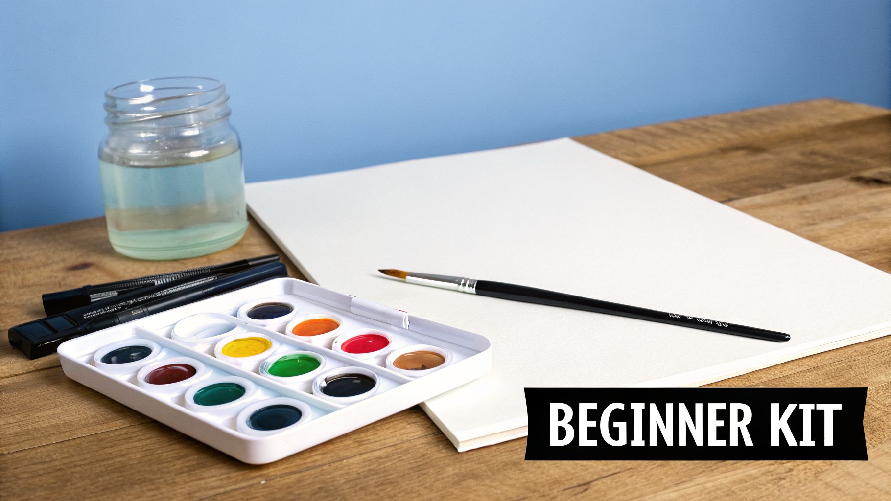
Gathering Your Essential Materials
Forget the endless aisles of art supplies for a moment. Your initial goal should be to get a small, functional kit with quality where it counts most. If you’re going to invest in one thing, make it your paper. Everything else can be upgraded over time.
To simplify your setup, here's a table outlining the absolute must-haves.
Essential Watercolor Supplies for Beginners
| Item | What to Look For | Pro Tip |
|---|---|---|
| Paper | Cold-press, 140 lb (300 gsm) weight. This is non-negotiable. Its weight prevents buckling, and the slight texture is perfect for learning. | Don't use sketch or printer paper. It will fall apart. Buy a pad or a block to start—blocks have glued edges that help keep the paper flat as it dries. |
| Paints | A basic pan set with 12 colors. Pan paints are solid cakes that are portable, reusable, and less messy for beginners than tubes. | Resist the urge to buy a giant set of 48 colors. You can mix nearly any color you need from a basic palette, which is a foundational skill in itself. |
| Brushes | A size 8 round and a 1-inch flat brush. These two are workhorses. The round is for details and lines, while the flat is for broad washes. | Natural hair brushes hold more water, but quality synthetics are fantastic and more affordable. Focus on a brush that holds its shape when wet. |
| Water & Palette | Two containers for water (one for rinsing, one for clean water) and a simple ceramic plate or a plastic palette for mixing. | Using a clean white ceramic plate helps you see your colors true to life. The dedicated "clean water" jar is my secret to keeping colors bright, not muddy. |
With these items, you have everything you need to start painting right away.
Connecting with a Rich Artistic Tradition
When you dip your brush in water, you’re not just painting; you’re tapping into a creative practice with an incredibly deep history. Artists were mixing pigments with water over 17,000 years ago to create the breathtaking cave art of Lascaux, France.
Later, during the European Middle Ages, transparent watercolor was the go-to medium for over 90% of the era's vibrant illuminated manuscripts. But it was Renaissance master Albrecht Dürer who truly elevated the medium in the 1490s with his meticulous botanical illustrations and atmospheric landscapes, setting the stage for the expressive potential we explore today.
The beauty of watercolor is that you don't control it completely. You guide it. Learning to embrace the unexpected bleeds and blooms is part of developing your unique artistic voice.
This mindset is everything. Let go of the need for perfection and simply observe. See what happens when you add a little more water. Watch how colors mingle on a wet page. Every painting session is a discovery, building your intuition and confidence for the techniques we'll dive into next.
Mastering Foundational Watercolor Techniques
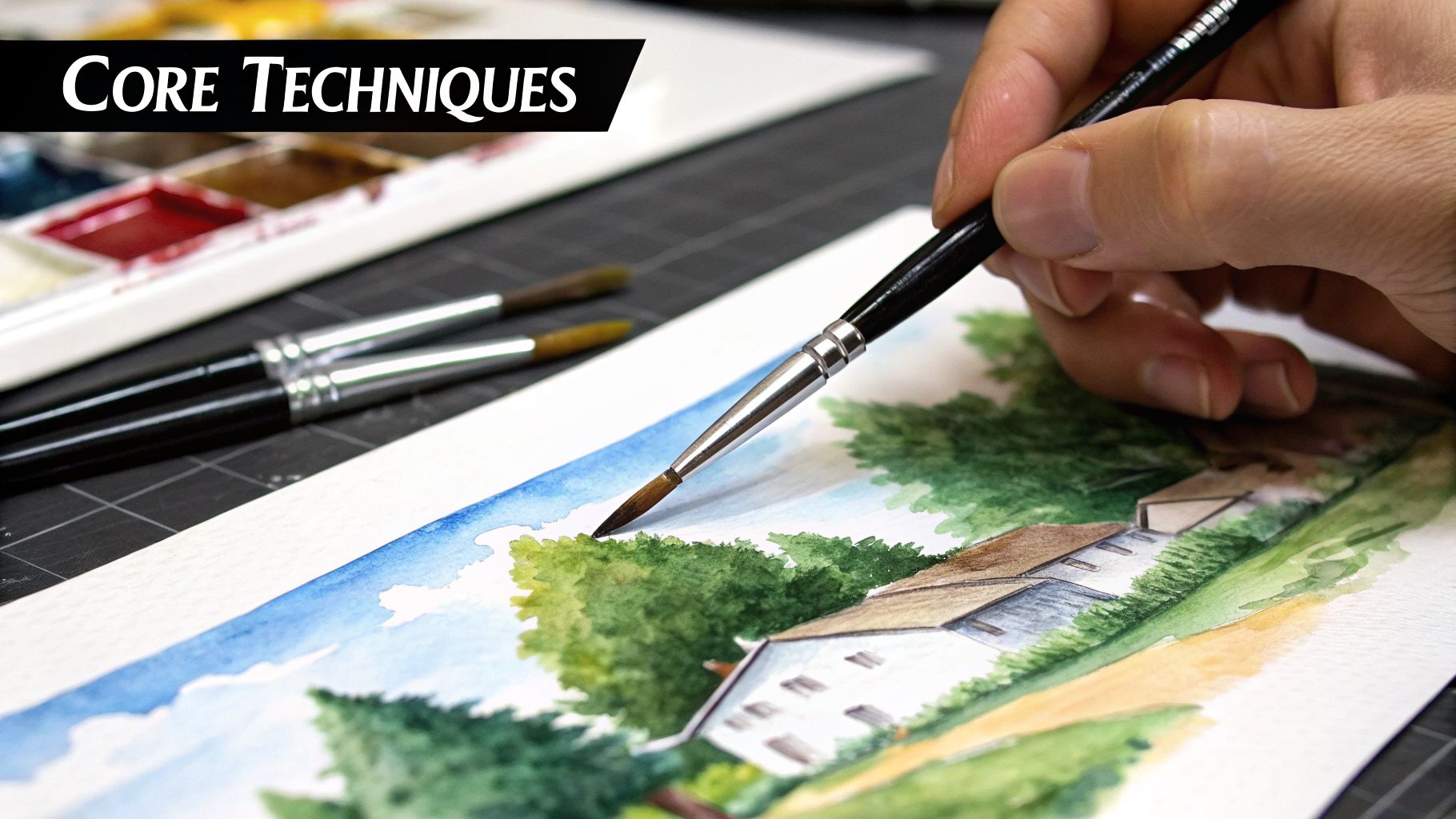
This is where the real work—and the real fun—begins. We're moving from theory to practice to explore the essential techniques that form the vocabulary of every watercolorist. Think of these not as rigid rules, but as a set of tools you can use to bring your vision to life on paper.
Getting a feel for these foundational skills is your first true step toward painting with confidence. Each method gives you a different way to control the water and pigment—or, just as importantly, to let go of control and embrace the medium's beautiful unpredictability.
Creating Washes for Atmosphere and Form
The wash, a simple, transparent layer of color, is the absolute bedrock of watercolor painting. If you can master the two primary types, the flat wash and the graded wash, you’ll be able to create smooth skies, distant hills, and the subtle play of light across any form.
For a flat wash, the name of the game is consistency. Think about painting a clear summer sky. You’ll start by mixing a generous puddle of your chosen blue. Then, tilt your paper at a slight angle—around 15 degrees is perfect—and load up your brush.
Begin at the top with a single, fluid stroke from one side of the paper to the other. You'll see a small bead of paint gather along the bottom edge of that stroke. Your next stroke should slightly overlap the first, picking up that bead and pulling it down the page. Just repeat this process until the area is filled, and you'll be left with a beautifully even field of color.
A graded wash, on the other hand, is all about creating a slow shift in value. It’s perfect for capturing a sunrise or the way light fades across a wall. You start it just like a flat wash, but with each new stroke, you introduce a tiny bit of clean water to your brush or pigment puddle. This gently dilutes the color, creating a seamless and atmospheric gradient.
The Magic of Wet-on-Wet Painting
The wet-on-wet technique is where the spontaneous, often magical, qualities of watercolor really shine. It simply means applying wet paint onto paper that is already damp, whether with clean water or a previous wash that hasn't dried. The result is those soft, blooming edges that watercolor is so famous for.
This method is your go-to for creating effects like:
- Soft Cloud Formations: After wetting your sky area, a few dabs of a slightly darker gray or blue will spread and diffuse into believable, fluffy clouds.
- Misty Horizons: Where the sea meets the sky, a wet-on-wet application can produce a beautifully soft, hazy transition.
- Blurred Backgrounds: This is how you push distant elements further into the background, adding a real sense of depth to a landscape.
The secret to wet-on-wet is all in the timing. How much water is on the paper directly controls how much your paint will spread. If it’s swimming, you'll lose all definition; if it's just barely damp, you won't get those soft edges. You have to experiment to find the sweet spot.
Many artists, myself included, love combining the looseness of this technique with sharper, more controlled details. If you're interested in exploring this further, our guide to impressionistic painting techniques offers some great ideas.
Adding Texture with Dry Brush
As a complete contrast to the fluid world of wet-on-wet, the dry brush technique is all about creating texture and grit. You achieve this by using a brush that's loaded with rich pigment but contains very little water. It should feel almost dry to the touch.
When you drag this nearly-dry brush across the tooth of your cold-press paper, the paint only catches on the raised peaks of the paper's texture, skipping the valleys. This leaves a broken, scratchy mark that’s incredibly effective for suggesting things like weathered wood, the sparkle of light on water, or the rough face of a rock.
Building Depth with Layering and Lifting
Because watercolor is transparent, you build richness and depth through layering thin washes of color. This process, often called glazing, is fundamental. The most important rule here is patience: you must let each layer dry completely before adding the next. If you rush and paint over a damp layer, you’ll just lift the color underneath and end up with a muddy mess.
On the flip side, lifting is the technique of actively removing paint to create highlights or fix a passage that’s gone too dark. While a wash is still damp, you can use a "thirsty" brush (one that's clean and just barely damp) to blot and soak up color. If the paint is already dry, you can re-wet an area with a clean brush and gently dab the pigment away with a sponge or paper towel. It’s a real get-out-of-jail-free card.
Mixing Colors and Building Your Palette
Color is where your painting finds its voice. It’s what communicates a quiet mood, a dramatic atmosphere, or a burst of emotion. But you don't need dozens of paint tubes or a degree in color theory to get it right. In my experience, the real breakthrough comes from learning to mix colors intuitively from a small, well-chosen palette.
Forget trying to memorize a complex color wheel. We're going to take a much more practical approach by starting with a limited set of primary colors. This discipline not only saves you a surprising amount of money on supplies but, more importantly, it forces you to create colors that are naturally related to each other, bringing a beautiful harmony to your work.
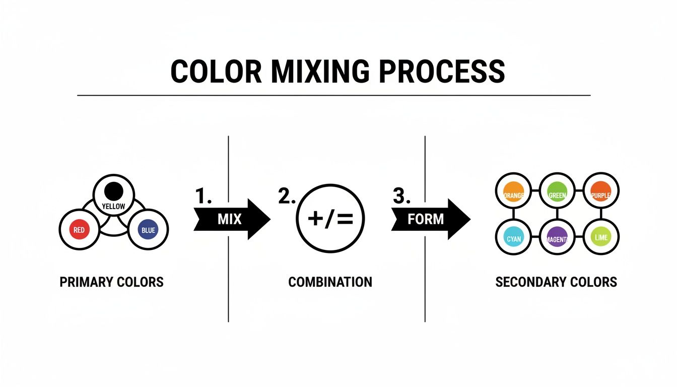
Starting with a Limited Primary Palette
The foundation for nearly any color you'll ever need can be mixed from just a red, a yellow, and a blue. The secret, however, is that not all primaries are the same. For the most versatile mixing range, you'll want both a warm and a cool version of each.
A split-primary palette like this is a game-changer:
- Warm Red: Leans toward orange (like Cadmium Red).
- Cool Red: Leans toward purple (like Alizarin Crimson).
- Warm Yellow: Leans toward orange (like Cadmium Yellow).
- Cool Yellow: Leans toward green (like Lemon Yellow).
- Cool Blue: Leans toward green (like Phthalo Blue).
- Warm Blue: Leans toward purple (like Ultramarine Blue).
With just these six tubes of paint, you unlock an incredible spectrum. For example, mixing a cool yellow (Lemon Yellow) with a cool blue (Phthalo Blue) gives you a crisp, vibrant green. But if you mix that same yellow with a warm blue (Ultramarine), you get a more muted, earthy green because the Ultramarine has a touch of red in it.
Grasping these subtle temperature "biases" is how you finally stop making muddy colors by accident and start mixing the exact hue you're imagining. This is a fundamental skill that applies across different mediums. If you also enjoy acrylics, you might find our guide on how to mix acrylic paint colors to be a useful point of comparison.
The goal isn't just to match a color you see in a photo. It's about mixing a color that feels right for the story you're telling. A stormy sea isn't just "blue"—it's a complex dance of blues, grays, and even violets that captures the raw power of the ocean.
Building Your Own Color Mixing Chart
If there's one exercise I recommend above all others for mastering color, it's creating your own mixing chart. Think of it less as a chore and more as building a personal reference library for your specific paints. It’s how you truly get to know what your palette is capable of.
Start by drawing a simple grid on a sheet of watercolor paper. List your chosen primaries along the top edge and then list them again down the left side. From there, you just methodically mix each color from the top row with each one from the side column, filling the corresponding square with your new color.
This simple, hands-on activity teaches you more than any book ever could. You'll see exactly what kind of deep, moody purple your Alizarin Crimson and Ultramarine Blue create. This chart will become an indispensable tool you’ll reach for constantly.
Creating Depth with Warm and Cool Colors
Beyond mixing individual shades, the strategic placement of warm and cool colors is your most powerful tool for creating a sense of depth and guiding your viewer's attention. This is the core principle behind atmospheric perspective in landscape painting.
- Warm Colors (Reds, Oranges, Yellows): These colors feel active and seem to advance toward the viewer. Use them for foreground elements you want to feel close and important.
- Cool Colors (Blues, Greens, Purples): These colors feel calmer and appear to recede into the distance. They are perfect for backgrounds, far-off hills, or suggesting the vastness of a sky.
Picture painting that seascape again. You might render the sandy beach in the foreground with warm, golden yellows and rich, earthy browns. As the water moves away from the shore, it could shift from a warmer turquoise to deeper, cooler blues and purples toward the horizon. The sky in the far distance would be the coolest of all, creating a powerful illusion of miles of open space. This deliberate shift from warm to cool is what turns a flat piece of paper into a world the viewer can step into.
Guided Project: Painting an Emotive Seascape
This is where all our practice comes together. We’re going to take everything we've learned—from foundational techniques to color theory—and channel it into a single, expressive painting. We'll be creating a solitary seascape, a subject that I feel truly captures the beautiful, untamed spirit of watercolor.
Together, we’ll walk through the entire journey, from the first pencil mark to the final, defining brushstroke. My goal is to guide you in creating a piece that’s not just technically sound, but one that carries a genuine emotional weight.
Planning Your Composition
Before any paint touches the paper, the most crucial decisions happen in your mind. A strong composition is everything; it’s the invisible architecture that leads a viewer’s eye and tells the story. For our seascape, we’ll lean on a timeless principle: the rule of thirds.
Picture your paper divided into a nine-square grid by two horizontal and two vertical lines. Placing your most important elements along these lines or where they intersect creates a natural, dynamic balance. With a seascape, your first major decision is the horizon.
- A low horizon, resting on the bottom third, gives dominance to the sky. It's perfect for capturing the drama of storm clouds or the vastness of a sunset.
- A high horizon, placed on the top third, pulls the viewer’s focus down into the water—its texture, its power, and its depth.
For this piece, let's place our horizon high on that top third. This choice makes the churning, powerful sea our focal point, creating an immersive feeling, as if we’re standing right at the water's edge. A light pencil sketch is all you need to mark this line.
Building the Sky and Horizon
With our composition mapped out, we can begin to lay down color. I always find it best to work from the top of the paper downwards, starting with the sky. We’re aiming for a soft, moody, and slightly overcast atmosphere that sets the tone for a solitary sea. A graded wash is the perfect technique for this.
Start by mixing a watery pool of a cool blue, like Phthalo Blue, softened with just a hint of a neutral gray. Prop your paper up at a slight angle—about 15 degrees should do it. Now, load your brush and apply a single, confident stroke across the top. As you move down toward the horizon, add a little more clean water to your brush with each pass. This simple trick will naturally lighten the color, creating a believable sense of atmospheric distance.
As you near your pencil line, the key is to keep that area of the paper damp. This allows for a seamless, wet-on-wet transition where the sea and sky will eventually meet. While the sky wash is still glistening, drop a slightly more concentrated mix of your sky color right along the horizon. You’ll see the pigment bloom softly into the damp paper, creating that beautiful, diffused edge you see on a hazy coastal day.
Layering the Depths of the Sea
Now for the main event: the ocean itself. The secret to painting believable water is building up transparent layers, or glazes. This is a core skill in watercolor, and the most important rule is patience. You absolutely must let each layer dry completely before adding the next, or you risk making mud.
First Layer: The Foundation
Begin with a light, foundational wash across the entire area you've designated for the sea. A simple mix of a cool blue and a touch of green, like Viridian, works beautifully to establish the water's underlying color.
Second Layer: Building Form
Once that first layer is bone dry to the touch, you can start suggesting the larger forms of the swells and waves. Using a slightly darker and bluer version of your sea color, gently paint the shadowed undersides of the rolling water. Think of these as soft, suggestive shapes, allowing the lighter base color to shine through as the sunlit tops of the waves.
This process of combining colors is fundamental. Mixing your own rich, complex greens and blues from a simple primary palette is what will give your sea its unique and vibrant character.
Adding Texture and Final Details
This is the stage where the magic happens and your painting truly comes alive. With the major forms established, we can now use more specific techniques to create texture, movement, and a clear focal point.
The foreground waves, where water is crashing and churning, call for a different touch. This is a perfect opportunity to use the dry brush technique. Grab a small round brush and load it with a thick, almost opaque white gouache (or a very light, milky mix of your sea colors). Then, blot most of the moisture onto a paper towel until the bristles feel almost dry.
Lightly skim the brush across the darker, shadowed parts of the foreground water. The paint will only catch on the raised "peaks" of the paper's texture, instantly creating the broken, sparkling look of sea spray and foam. A little goes a long way here, so use it selectively for the most impact.
The real measure of success for this piece isn’t about perfectly copying a scene, but about capturing a feeling. Let your brushstrokes be confident, but not stiff. Embrace the happy accidents—those unexpected blooms and bleeds are the very soul of watercolor.
For rendering the glistening effect on the water's surface, you might want to explore other methods. I go into much greater detail on this specific skill in another guide where you can learn more about how to paint water reflections. The principles of light and shadow I discuss there can add a whole new level of realism to your work.
Finally, step back and look at your work from a distance. Does it need a touch more contrast? A few dark, deliberate accents under the breaking waves can add a tremendous amount of depth. Use a fine-tipped brush with your darkest sea mixture to place these final, defining marks. Let it dry completely, and you’ll have done more than just paint the sea—you’ll have created an emotive scene infused with your own artistic voice.
Troubleshooting Common Challenges
Every artist, no matter how long they've been painting, runs into trouble with watercolor. These hurdles aren't a sign that you're doing something wrong; they’re an essential part of growing as a painter. Learning to work through these common issues is what will ultimately build your confidence and give you the freedom to experiment.
Think of each challenge as a conversation with your materials. The paint and paper are constantly giving you feedback. The real skill is learning to listen to what they're telling you.
Preventing Muddy and Lifeless Colors
One of the most common frustrations I hear is about vibrant colors turning into a dull, lifeless brown on the page. This almost always comes down to one of two things: overworking the paper or using dirty water. When you pile on wet layers without letting them dry, the pigments mix into a physical sludge, neutralizing each other's brilliance.
The fix here is surprisingly simple: patience and clean water.
- Master the Glaze: Put down a thin wash of color and then walk away. Let it dry completely—not just tacky to the touch, but bone dry. Only then should you apply the next layer. This keeps the colors transparent, allowing them to blend with light rather than mixing into mud.
- Use the Two-Jar System: This is a non-negotiable habit for me. One jar of water is purely for rinsing pigment from your brushes. The second jar is your "clean" source, used only for mixing with fresh paint. This simple trick keeps your colors from getting contaminated and looking dull.
When colors become muddy, it's often because we're trying to force the paint to do something it isn't ready for. The magic of watercolor is in its transparency. Give your layers time to dry, and you'll find your colors start to sing.
By letting each wash settle and dry on its own terms, you’ll see a massive improvement in the clarity and glow of your work. This patient approach is truly foundational.
Managing Buckling and Warped Paper
Nothing disrupts your flow more than your paper warping into a landscape of hills and valleys, causing paint to pool in unwanted puddles. This happens when the paper’s fibers absorb water, expand, and then shrink unevenly as they dry. While a little bit of warping is normal, severe buckling can sabotage a painting.
The main culprit is usually the paper itself. Your standard drawing or printer paper just can't handle this much moisture. The most effective fix is investing in the right surface from the start.
To keep your paper flat, here are a few methods:
- Use Heavier Paper: Always paint on paper that is at least 140 lb (300 gsm). This thicker, more durable paper is made to take a wash with far less buckling.
- Try a Watercolor Block: These are pads of paper glued on all four sides. This holds the sheet taut while you work and as it dries, keeping it perfectly flat.
- Stretch Your Paper: For large pieces or extremely wet techniques, you can stretch your paper manually. This involves soaking the sheet, laying it on a rigid board, and taping the edges down securely. As the paper dries, it shrinks and becomes wonderfully tight and flat, like a drum.
For most painters, especially when you're still finding your feet, simply switching to heavier paper will make all the difference in the world.
Correcting Mistakes and Embracing Accidents
Watercolor has a reputation for being unforgiving, and the fear of making a permanent mistake can be paralyzing. But the truth is, you have more options for course correction than you might think. Better yet, many so-called "mistakes" can become the most beautiful, expressive parts of your work.
If you act quickly while the paint is still wet, you can often lift the color right off. Just take a clean, slightly damp brush (often called a "thirsty" brush) and gently blot the area. The brush will wick the pigment away. A corner of a paper towel or a natural sponge also works well for larger spots.
If the paint is already dry, you can still make adjustments. Carefully re-wet the spot with a clean brush, use a gentle scrubbing motion to reactivate the pigment, and then blot it away. Just be careful not to scrub so hard that you damage the surface of the paper.
Sometimes, the best move is to lean into the accident. An unintentional drip could become a distant bird; a bloom of runaway color might be the perfect starting point for a soft, misty cloud. Learning to see these opportunities is the mark of a truly creative artist. It's less about control and more about collaborating with whatever the paint gives you.
Developing Your Own Artistic Voice
At some point, you’ll feel a shift. The initial focus on mastering a flat wash or getting your wet-on-wet blends just right will give way to a deeper question: what do you actually want to say with your art? This is where the real magic happens—where you move beyond just painting a picture to creating a personal statement.
This is the journey from simply copying what you see to infusing your work with your own unique perspective. It’s about figuring out how to make watercolor your language for expressing a feeling, a memory, or a specific point of view.
Finding Subjects That Speak to You
The first step in finding your voice isn't about some grand, abstract search. It's much simpler: paint what you love. I mean, what you truly love. Forget the generic landscapes or still-life setups you think you're supposed to paint. What genuinely stops you in your tracks?
Maybe it's the quiet, almost lonely light of a city street after the rain. Perhaps it's the specific way the light hits the dust motes in your living room in the afternoon, or the endlessly complex personality you see in your dog's eyes.
When you have a real, personal connection to your subject, that passion finds its way onto the paper. You'll naturally pay more attention, your brushstrokes will have more conviction, and the work will start to feel alive. That emotional spark is the bedrock of a style that is truly your own.
A unique voice isn’t born from inventing a new technique; it’s born from a unique perspective. When you paint what you are genuinely passionate about, your style emerges naturally. The honesty of your interest is what makes the art truly original.
For a deeper dive into this very topic, we have a whole guide dedicated to it. You can get more strategies right here: how to develop your art style.
Experimenting with Your Personal Mark
Your voice is also found in how you physically apply the paint. It’s in your signature brushwork, your go-to color palettes, and the way you arrange elements in a scene. Now is the time to set aside the "rules" and just play. Think of it as focused experimentation.
Here are a few prompts I use myself when I feel stuck or want to shake things up.
Prompts for Creative Exploration:
- Emotional Color Palettes: Pick an emotion—joy, nostalgia, anxiety—and paint a small study using only colors that you feel represent that mood. Don't worry about making it look "real." The goal is to see how far you can push color to create an emotional impact.
- Brushwork Variations: Take a simple object, like an apple or a coffee mug, and paint it 3 different ways. First, use only soft, bleeding wet-on-wet washes. Next, use only crisp, textured dry brush marks. Finally, try combining the two. You'll be surprised how the character of the object changes with each approach.
- Narrative Prompts: Think of a simple story or a powerful memory. How would you paint the feeling of it without being literal? Try using abstract shapes, symbolic colors, and composition to hint at the narrative.
These exercises aren't about creating a finished masterpiece. They're about building a personal library of marks, colors, and ideas that feel like you. Through this kind of consistent practice, your technical skills and personal expression will finally merge, and your art will become a true reflection of who you are.
Answering Your Watercolor Questions
As you get more comfortable with your brushes, you're bound to run into a few questions. It happens to every artist. Here are my thoughts on some of the most common hurdles painters face, based on my own experience in the studio.
What's the Best Paper for Someone Just Starting Out?
When you're learning, your paper choice can either be your biggest ally or your greatest source of frustration. My advice is to focus on weight first and foremost.
Look for a cold-press paper that’s at least 140 lb (300 gsm). Anything thinner will buckle and warp the minute you apply a generous wash, which is incredibly discouraging. This thicker paper is sturdy enough to take a beating as you experiment.
Cold-press has a subtle texture, or "tooth," that grips pigment beautifully, making it very forgiving. While cheaper student-grade pads are okay for quick sketches, you will see a massive leap in quality by switching to a 100% cotton artist-grade paper. It truly lets the colors shine.
How Do I Stop My Colors from Turning to Mud?
Ah, the dreaded muddy painting. This almost always comes down to one of two things: mixing too many colors on your palette, or, far more commonly, not letting your layers dry completely on the paper.
To keep your colors looking clean and vibrant:
- Patience is everything. You absolutely must let each layer of paint dry before adding the next. When you paint over a damp wash, the new color physically churns up the pigment underneath, creating a dull sludge.
- Use two jars of water. This is a simple but game-changing habit. Keep one jar for rinsing pigment from your brushes and a second one with clean water for mixing into your paints. This stops you from contaminating your fresh colors from the get-go.
I tell every student the same thing: the number one cause of muddy paintings is impatience. When you give each layer time to dry, you’re allowing light to pass through the transparent colors and bounce off the white of the paper. That’s what creates luminosity—not just piling on wet paint.
Can I Still Paint with Watercolors If I'm Not Good at Drawing?
Yes, absolutely! In fact, watercolor is a fantastic medium for people who don't feel confident in their drawing skills. The magic of watercolor is often found in its expressive qualities—color, atmosphere, and texture—not in perfect, realistic lines.
You can create stunning work just by playing with:
- Abstract fields of color
- Loose, impressionistic landscapes
- Atmospheric skies and seascapes
And if you do want to paint something more recognizable, there's no shame in lightly tracing a reference photo to get your composition right. Ultimately, watercolor is about what the paint and water do on the paper; your unique expression will come from that process, not from your ability to draw a perfect circle.