Discover new image art & framing: Master Techniques for Showcase-Worthy Displays

You’ve found a piece of art that speaks to you. That's a wonderful feeling. But getting it from the gallery or the shipping tube onto your wall involves one final, crucial step: framing. The right frame doesn't just protect the art; it completes it, turning a piece you love into a true centerpiece for your home.
Your approach to new image art & framing is the final brushstroke that connects the artwork to your space.
Your First Decisions In Art Framing
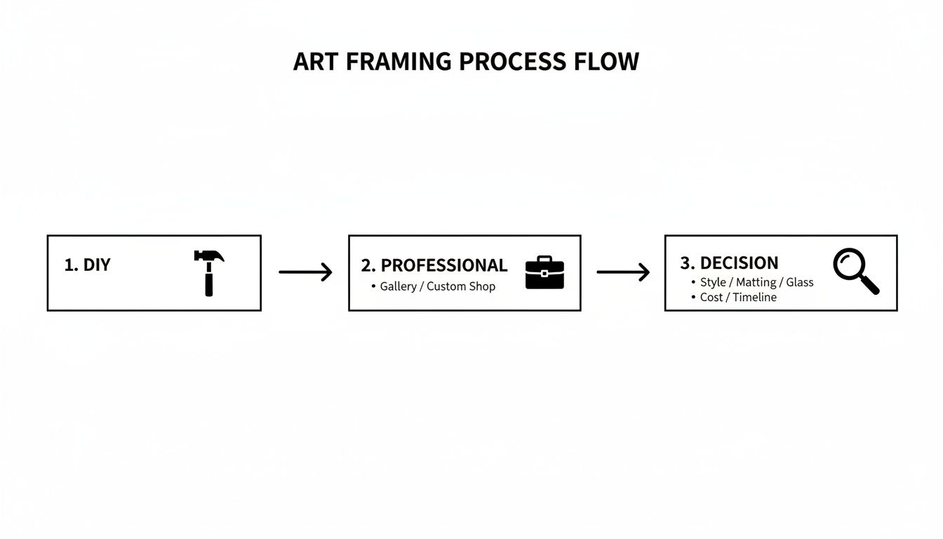
Once you have your new art in hand, the first big question is whether to call in a professional or tackle the framing yourself. There's no right or wrong answer here; the best choice really comes down to the artwork itself, your budget, and how comfortable you are with a hands-on project.
Think of it this way: an original watercolor with delicate, hand-torn edges is a perfect job for a professional. They have the experience and archival materials to preserve it for generations. On the other hand, a standard 8×10 print you found online is a fantastic opportunity for a weekend DIY project, giving you the freedom to play with off-the-shelf frames and mats without much risk.
To help you decide, here’s a quick look at how the two paths compare.
Professional vs DIY Framing At A Glance
This table offers a snapshot to help you choose the best path for framing your new artwork, considering your needs, budget, and the piece itself.
| Factor | Professional Framing | DIY Framing |
|---|---|---|
| Cost | Higher upfront investment, but includes all labor and materials. | Lower initial cost, but materials can add up. Tools may be an extra expense. |
| Expertise | Access to skilled craftsmanship and archival preservation techniques. | Relies on your own skill level and research. A great way to learn. |
| Materials | Vast selection of high-quality, conservation-grade materials. | Limited to what’s available in stores or online. Quality can vary. |
| Time | Saves you time and effort; drop it off and pick it up when ready. | Requires a significant time commitment for measuring, cutting, and assembly. |
| Best For | Valuable originals, delicate pieces, oversized art, or complex projects. | Standard-sized prints, posters, personal photos, or budget-conscious projects. |
Ultimately, whether you go with a pro or do it yourself, the goal is the same: a beautifully presented piece of art. Your decision here simply sets the course for the rest of the project.
Understanding The Language Of Framing
Before you can confidently bring your vision to life, it helps to speak the language. Knowing these basic terms will make your conversations infinitely easier, whether you're at a custom frame shop or browsing the aisles of a craft store.
- Glazing: This is the clear protective layer over your artwork, which can be glass or acrylic. It comes in different finishes, with UV-protective and anti-reflective options being the most important for preservation and viewing.
- Mat (or Matboard): A mat is the border—usually made of archival paper or fabric—that sits between your art and the frame. Its main purpose is to create some breathing room and, crucially, to keep the art from directly touching the glazing, which can lead to moisture damage over time.
- Rabbet: This is the small ledge or groove on the inner edge of the frame that holds the entire "sandwich" of glazing, mat, art, and backing in place. The depth of the rabbet dictates how thick your art package can be.
Don't underestimate the power of the frame. It's so much more than a border; it’s an extension of the art itself, bridging the gap between the canvas and the character of your home.
Making the right choices at the beginning is everything. Your decision between a professional and a DIY approach will shape your budget, timeline, and the materials you end up using. While choosing the art is a deeply personal journey, framing is the final, critical chapter in telling its story. If you're still looking for that perfect piece, our guide on how to choose art for your home offers some helpful insights.
Building a solid foundation of knowledge from the start is the surest way to ensure your new image art & framing project ends with a result you'll be proud to display.
Measuring Your Artwork for a Flawless Fit
Before you even think about frame styles or mat colors, the first and most critical step is getting your measurements right. I’ve seen more framing projects go sideways from a simple measurement error than for any other reason. An eighth of an inch might not sound like much, but in framing, it’s the difference between a professional fit and a costly do-over.
Grab a rigid steel tape measure—not a flimsy sewing tape—and lay your artwork on a clean, flat surface. You'll want to measure both the height and the width. I always measure each dimension in at least two different places. You'd be surprised how often paper isn't cut with perfect 90-degree angles. If you get two different readings, always use the smaller of the two. This guarantees the artwork will fit inside the mat or frame.
Accounting for Borders and Depth
Now, let's talk about the nuances. Look at your art and consider the image itself versus the full paper size. If there's a white border around the image, you have a decision to make. Do you want the mat to cover that border and overlap the image slightly, or do you want to reveal the entire sheet of paper, especially if there's a signature or edition number in the margin?
This decision is one of the first forks in the road in the framing process, as you can see below.
As the visual shows, your early choices have a ripple effect. Getting the measurement and border approach right from the start sets the entire project up for success.
Don't forget about depth, especially for anything that isn’t a flat print. For a painting on canvas board or a mixed-media piece with a lot of texture, you need a third measurement. Measure the artwork at its thickest point. This ensures the frame's rabbet—that’s the groove on the back of the frame—is deep enough to hold everything.
A little trick of the trade is to build in an "allowance." A professional framer will cut the mat opening and frame about 1/16 to 1/8 inch larger than the artwork itself. This tiny bit of wiggle room is crucial, as it prevents the art from buckling with small shifts in humidity and temperature over time.
The Rule of Eighths in Practice
In the framing world, we live by eighths of an inch. When you communicate with a framer or order online, this is the language you'll use. For instance, if your print is exactly 8 inches wide, you'd order an 8-inch frame. However, the mat opening might be cut to 7 7/8" to create that clean, slight overlap on the image.
Here’s how this works in a couple of common scenarios:
- For a standard photographic print: You’ll measure the exact dimensions of the paper. The framer will then typically cut the mat to overlap the image by about 1/8" on all sides, hiding the paper's edge.
- For a drawing with deckled edges: Measure to the absolute widest and tallest points of those beautiful, torn edges. In this case, you wouldn't use a traditional mat opening. Instead, you'll "float" the art on top of a solid matboard, so the measurements are for the backing board, not an opening.
Once you’ve mastered the art of framing, the next step is getting it on the wall. For helpful advice, particularly if you're dealing with heavier pieces, our guide on how to hang large canvas art is a great resource. Taking these careful steps now is the secret to a result you’ll be proud of for years to come.
Choosing The Right Mat And Glazing
Once you have your measurements, your focus should shift to two of the most critical decisions in the framing process: choosing the right mat and glazing. These aren't just decorative elements; they are your artwork's primary line of defense against physical damage, pollutants, and the slow, irreversible damage caused by light. Getting this part right is non-negotiable for preserving your art.
The mat board does more than create a visual border. It creates a crucial pocket of air between your artwork and the glazing, which stops moisture from getting trapped and ruining the piece. But a word of caution: not all mats are the same. Cheap paper mats contain acid that will yellow over time and literally burn an ugly, discolored line into your art—a permanent problem known as "mat burn."
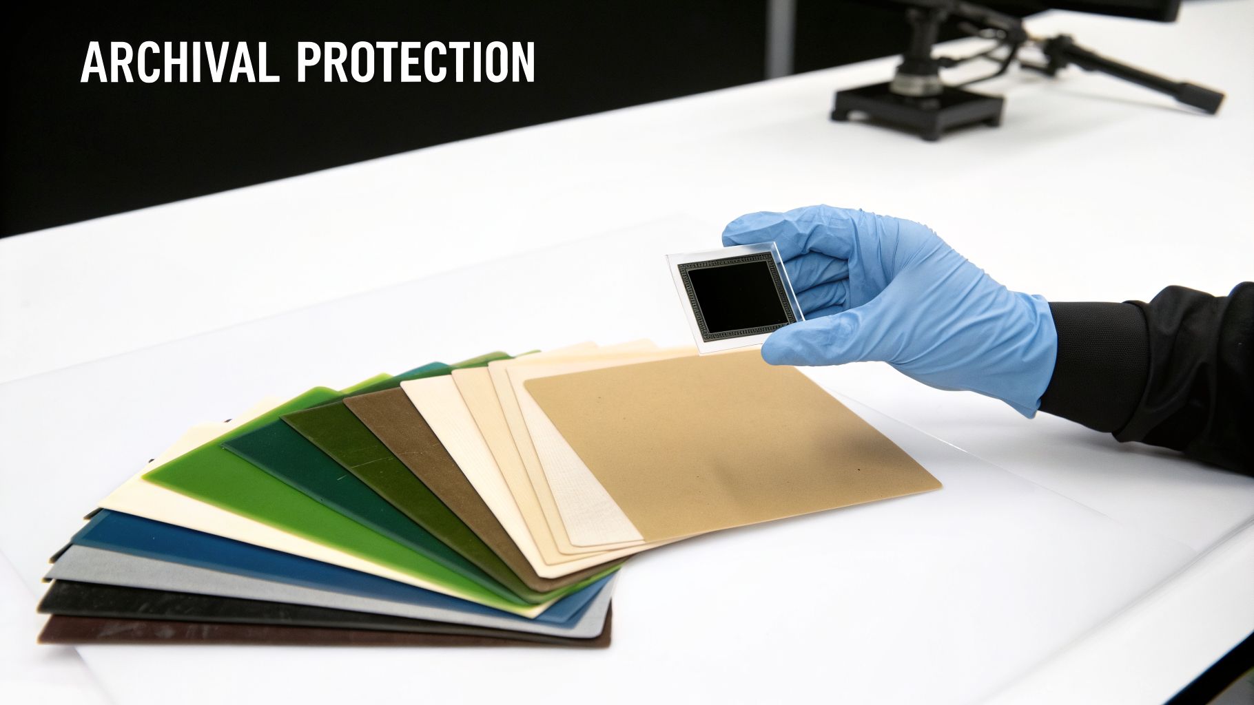
If you care about the art, always insist on archival-quality rag mats. Made from 100% cotton, these mats are naturally acid-free and lignin-free, meaning they won't degrade or harm your art. The small extra cost upfront is tiny compared to the long-term preservation you're buying.
Selecting Your Mat Color
Picking a mat color is a delicate balance. The idea is to complement the artwork, not overpower it. If you’re framing an impressionistic seascape, for example, choosing a bold blue mat might drown out the very subtleties you love in the painting. My advice is to always look for a neutral or a quiet supporting color from the piece itself.
- Stick with Neutrals: You can never go wrong with off-whites, soft creams, or pale grays. They are timeless, create a clean breathing space around the art, and let the piece speak for itself.
- Pull a Secondary Tone: Find a less-dominant color within the artwork and select a mat that's a few shades lighter. For a seascape, this might be a sandy beige from the shore or a soft gray pulled from a distant cloud.
- Try a Double Mat: This is a classic professional technique for a reason. Using a double mat, where a sliver of a second, often darker, color peeks out from beneath the main mat, adds incredible depth and helps guide the viewer's eye right into the artwork.
Understanding Glazing Options
Glazing is the clear shield protecting your art, and what you choose here matters immensely. Standard glass might seem fine, but it offers almost no UV protection and shatters into dangerous shards. For any artwork with personal or monetary value, you absolutely need to look at conservation-grade options. The term "glazing" covers both glass and acrylic, and we delve deeper into the specifics in our article about what is glaze in art.
Your choice of glazing is one of the single most important decisions you'll make for the long-term health of your art. It’s the difference between a piece that fades in five years and one that remains vibrant for fifty.
To help you decide, here is a quick comparison of the most common glazing types available, breaking down what they do best.
Glazing Options For Artwork Protection
A comparison of common glazing types to help you select the best protection for your art based on your specific needs and budget.
| Glazing Type | Key Feature | Best For | UV Protection |
|---|---|---|---|
| Standard Glass | Clarity and affordability | Budget-friendly projects for non-valuable art | Less than 50% |
| Standard Acrylic | Shatter-resistant and lightweight | Large pieces, high-traffic areas, or shipping | ~65-75% |
| UV-Protective | Blocks damaging ultraviolet light | All original art, limited editions, and photos | 99% |
| Anti-Reflective | Reduces glare for optimal viewing | Art displayed in brightly lit rooms | Varies; often combined with UV protection |
As you can see, the options vary significantly. Professionals rely on archival mats and 99% UV-protective glazing because they work. These materials are your best insurance policy, safeguarding your art from fading and environmental harm, which in turn preserves its beauty and its value for decades.
How to Select a Frame That Truly Elevates Your Art
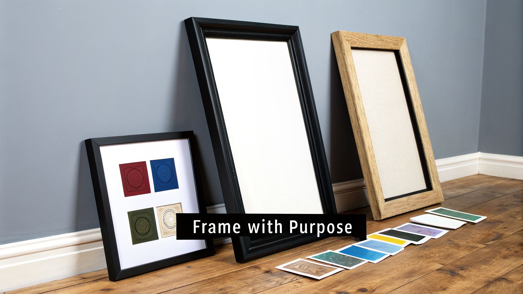
The frame isn't just a border; it’s the final brushstroke that connects a piece of art to your home. Choosing the right one is about more than just matching a color. It’s a delicate balance between the artwork’s own character, the frame’s material, and the room where it will ultimately live. When you get it right, the result feels both intentional and completely effortless.
Think about an impressionistic seascape, with its soft light and dreamy textures. For a piece like that, I almost always lean toward a simple, light-toned wood frame. A minimalist maple or even a weathered white oak can echo the artwork's organic feel without stealing the show. The goal is to complement the art's quiet mood, not compete with it.
On the other hand, a bold, modern abstract piece often calls for something entirely different. A sleek, black metal gallery frame creates a crisp, clean edge that makes vibrant colors explode off the canvas. It’s a sharp, contemporary look that respects the high energy of the art itself.
Traditional Profiles vs. Floater Frames
The medium of your artwork will heavily influence your choice of frame profile. Works on paper, like watercolors or prints, almost always need a traditional frame paired with a mat and protective glazing. For canvases, however, you have a wonderfully modern option: the floater frame.
A floater frame gives the illusion that the canvas is suspended in mid-air, leaving a small, shadowy gap between the edge of the painting and the frame itself. It’s a sophisticated touch that works especially well for canvases with finished, painted edges, adding a real sense of depth. This is a signature look in professional new image art & framing that gives any piece a polished, gallery-ready feel.
Harmonizing the Art with Your Interior
The best framing choices always take the room into account. You're looking to create a conversation between the art and its surroundings, not an argument. Before you commit, take a moment to look around the space.
- Color Palette: Try pulling a subtle hue from your room's decor—perhaps a secondary color from a rug or a throw pillow—and see if a frame in a similar tone can tie everything together. You can explore more on the powerful role of hues in our guide to color psychology in interior design.
- Material and Texture: If your room is filled with warm woods, a matching wood frame is a natural choice. For a more industrial space with metal accents, a clean steel or black frame will feel more at home.
- Scale and Proportion: The frame's width should feel balanced with the art's size. A tiny, delicate frame will look lost around a massive canvas, just as a heavy, ornate frame can completely overwhelm a small, intimate sketch.
A great frame never shouts for attention; it whispers. Its job is to quietly support and elevate the artwork, making the entire composition feel complete and at home in its space.
By carefully considering the art, the frame, and your decor, you’re not just hanging a picture. You're thoughtfully curating your space and ensuring your new artwork becomes a celebrated part of your home.
Mastering The Final Assembly And Hanging
You’ve carefully selected the frame, mat, and glazing. Now comes the part that truly separates a professional finish from an amateur job: the final assembly. How you secure the artwork inside the frame is everything.
Let me be clear on one non-negotiable rule: whatever you do, it must be 100% reversible. This is the golden rule of conservation. Never, ever let permanent tape or glue touch your actual artwork.
For any work on paper, the easiest and safest route is using archival photo corners. These are simply small, acid-free pockets that slip over the corners of your art, holding it firmly to the backing board without any adhesive ever touching the piece itself.
A more advanced technique, and the one professionals prefer, involves creating "T-hinges" from Japanese paper and archival wheat paste. You create small, hinged tabs that secure the very top edge of the art to the backing, which allows the piece to hang naturally. This is critical because it gives the paper room to expand and contract with shifts in humidity, preventing buckling over time.
Securing Canvases And Shipping Framed Art
Mounting a stretched canvas requires a different approach, especially if you're using a floater frame. Here, the canvas is attached from the back of the frame, not the front.
You'll use offset clips, which are small, Z-shaped metal brackets. These clips screw into the back of the frame and overlap onto the canvas stretcher bars, holding the art securely in place while maintaining that clean, "floating" gap all the way around.
If you find yourself needing to ship your newly framed art, you have to be meticulous about protection. The corners and the glazing are the most vulnerable points.
- Corner Protection: Always use heavy-duty cardboard or foam corner protectors. Tape them on securely, as they will absorb the brunt of any impact if the box is dropped.
- Glazing Safety: For glass glazing, I strongly recommend applying low-tack painter's tape across the surface in a large "X" or star pattern. If the unthinkable happens and the glass breaks, the tape will hold the shards together, preventing them from shredding your art.
- Padding: Once the corners and glass are secured, wrap the entire frame in several layers of bubble wrap. Only then should it go into a sturdy, snugly-fitting cardboard box.
The final details of assembly are not just for aesthetics; they are functional components that protect your investment. A sealed back and proper hanging hardware ensure the art remains secure and pristine for years to come.
Applying The Finishing Touches
The last steps in the new image art & framing process are what make the piece ready for the wall. First, you'll want to seal the back with a dust cover—a sheet of kraft paper cut just a bit smaller than the frame's outer edges. This simple barrier is surprisingly effective at keeping dust, debris, and even insects out of the frame package.
Next, you’ll attach the hanging hardware. I always use two D-rings, positioning them about one-third of the way down from the top on each side of the frame. String a coated picture wire between them, but don't pull it taut. Leave just enough slack so that the peak of the wire, when pulled up, sits a couple of inches below the top of the frame.
Finally, stick small felt or rubber bumpers on the bottom two corners. This tiny detail protects your wall from scuffs and allows for air circulation behind the artwork, which is crucial for long-term preservation.
Common Questions About Framing Your New Artwork
When you've found a new piece of art, the next step—framing—can feel a little daunting. It’s a mix of art and science, and it’s completely normal to have questions. Getting the framing right not only makes the art look its best but also protects your investment for years to come. Here are some of the most common questions I hear, along with my practical advice.
How Much Should I Expect To Spend On Custom Framing?
This is easily the most frequent question, and the honest answer is: it varies enormously. A very small, simple framing job might start around $150, but it’s not unusual for a large, intricate project to cost well over $1,000.
The final price is built from several key components. The size of the artwork is the biggest factor, followed by your choice of frame moulding—solid wood will always cost more than metal or synthetic options. The quality of the matboard and the type of glazing you select also play a major role.
As a rule of thumb, it's quite common for the framing of an original piece of art to cost as much as, or even more than, the artwork itself. Think of it as an essential investment in preservation. Always ask your framer for an itemized quote so you can see exactly where the money is going before you commit.
What Is The Difference Between Conservation And Museum Grade Framing?
While you might hear these terms used interchangeably, they actually refer to two different levels of protection. Knowing the difference is crucial for making the right choice for your art.
"Conservation framing" is the professional standard for protecting any artwork of value. It means every material touching your art is acid-free and chosen for its longevity. This usually includes:
- Archival-quality matting and backing boards to prevent yellowing and acid burn.
- Reversible mounting techniques, so the art can be removed from the frame without damage.
- Glazing that blocks at least 99% of harmful UV rays.
"Museum-grade framing," by contrast, is the pinnacle of preservation. It incorporates all the features of conservation framing but takes it a step further, often by sealing the entire frame package. This creates a stable micro-environment inside, protecting the piece from shifts in humidity. This method is typically reserved for works of major historical significance or exceptional monetary value.
For most collectors looking to protect original paintings or limited-edition prints, conservation framing offers more than enough protection for a lifetime of enjoyment.
Choosing the right level of framing is about balancing preservation with practicality. For many, conservation-grade materials offer the perfect solution, providing robust defense against environmental damage without the expense of a fully sealed museum package.
Can I Put Glass Over A Textured Canvas Painting?
This is a common question, but putting a textured canvas painting directly under glass is something I strongly advise against. The potential for damage is simply too high.
Canvases, especially those with oil or acrylic paint, need to "breathe." Placing glass directly on the surface traps air and any ambient moisture, which can create a humid pocket. Over time, this can lead to mold or mildew forming right on your painting.
Worse yet, if the peaks of the textured paint touch the glass, they can fuse to it as the years go by. If you ever try to separate them, you risk peeling the paint right off the canvas, causing irreversible damage.
The best way to frame a textured canvas is with an open frame or a floater frame. These styles protect the vulnerable edges and provide a beautiful finish without covering the artwork's surface, letting the unique texture shine.
How Do I Choose A Mat Color That Won't Overpower My Art?
A mat's job is to create a quiet, graceful transition from the artwork to the frame—it should never steal the show. The secret is to choose a color that harmonizes with the piece, not one that competes with it. For valuable art, exploring your options is key, as we discuss in our guide on the best places to buy original art online.
Start by looking for neutral tones or subtle secondary colors already present within the artwork. You can almost never go wrong with a classic off-white, a soft cream, or a pale grey. These shades give the art visual breathing room and have a timeless appeal.
If you want to use a colored mat, pull a minor color from the piece and choose a mat that is a few shades lighter or darker. Avoid the temptation to match the mat to the art's most dominant color; this often creates a distracting, "bullseye" effect. When in doubt, a crisp, archival white or off-white mat is a flawless choice.
At Skyler’s Art, every piece tells a story through impressionistic energy and personal narrative. Discover original acrylics, watercolors, and more, each created with heart and soul. Find the art that speaks to you at https://skylers-art.org.