
Color psychology in interior design: Mood-Boosting Ideas for Your Home
Color psychology in interior design is all about understanding how different hues can influence our moods, thoughts, and even our behavior within a space. It’s less about simple decoration and more about using color as a deliberate tool to craft a specific atmosphere—whether that’s tranquility, energy, or focus—right in your own home.
How Colors Secretly Shape Your Home's Atmosphere
Have you ever walked into a room and immediately felt at ease? Or stepped into a space that felt instantly electric and full of life? That powerful, often subconscious, reaction is the very essence of color psychology in interior design. It’s not just about picking a paint swatch you find pretty; it’s about consciously designing an emotion.
Every color carries its own distinct psychological weight, capable of completely altering how we perceive a room. A deep, enveloping blue can make a vast, open-plan area feel more intimate and secure. On the other hand, a soft, buttery yellow can make a small, darker room feel expansive and flooded with light. This is color’s silent language at work.
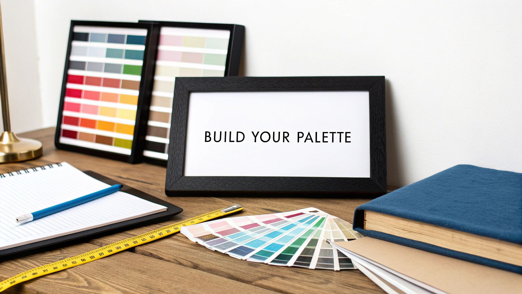
It's More Than Just Paint on a Wall
Grasping this idea fundamentally changes your approach to design. Instead of asking, "What color should I paint my living room?" the question becomes, "How do I want to feel in my living room?" This shift opens up a far more thoughtful and rewarding design journey, where the ultimate goal is to create spaces that actively support your well-being.
Color is a power which directly influences the soul. When designing a space, you are not just filling it with objects and colors; you are crafting an experience that will impact its inhabitants every single day.
Designing for Emotion and Well-Being
The science backing this up is firmly rooted in environmental psychology, a field that examines how our physical surroundings affect our mental state. Research has consistently shown that we have immediate, measurable reactions to our indoor environments. The strategic use of color can genuinely:
- Promote tranquility: Soothing palettes of blues and greens in a bedroom can encourage deep, restful sleep.
- Encourage productivity: Certain hues in a home office are known to sharpen focus and boost creativity.
- Foster connection: Warm tones in living and dining rooms create a welcoming, social vibe.
- Inspire creativity: Pops of vibrant color can stimulate the mind in a studio or a child’s playroom.
Of course, our reaction to color is also deeply personal, shaped by our culture, memories, and life experiences. A color one person finds calming, another might associate with something less pleasant. This is where truly great design happens—in the balance between universal color principles and what resonates with you personally. Exploring an artist's curated gallery can be a fantastic way to see how different palettes evoke distinct moods, sparking inspiration for your own project.
By understanding the foundational role color plays, you gain the power to shape your home’s atmosphere with real purpose. You move from being a decorator to becoming an architect of emotion, creating a home that doesn’t just look beautiful, but truly feels right.
Decoding the Emotional Spectrum of Color
Every color in your home tells a story without ever speaking a word. This silent narrative is built on powerful psychological associations, where each hue—from a fiery red to a tranquil blue—prompts a distinct emotional response. Mastering this spectrum is the first step toward creating spaces that don't just look good, but feel right.
Color’s influence runs deep because it connects to universal human experiences and our own personal memories. A bright, sunny yellow might universally suggest optimism and energy, while a deep forest green can tap into our shared desire for the restorative calm of nature. This emotional language is what allows us to design rooms that are intentionally crafted for our well-being.
This concept map shows just how central color is to our experience of a space, directly influencing our mood, guiding our behavior, and shaping our overall perception.
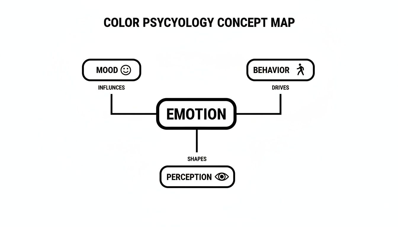
As you can see, our emotional response isn't just a side effect; it's the core driver that dictates how a room's atmosphere is ultimately felt and lived in.
The Cool Tones: Blues and Greens
When you think of calm, you probably think of blue. It’s the cornerstone of a soothing palette for a reason. Lighter shades, like a soft sky blue, make a room feel open and peaceful, making them a natural fit for bedrooms and bathrooms where serenity is the goal. Deeper blues, from navy to indigo, carry a different weight—they feel stable, trustworthy, and sophisticated, lending a powerful yet comforting presence to a home office or living room.
Green shares this restorative quality but with a more organic, grounding energy. Its connection to the natural world is undeniable. From soft sage to rich emerald, green has a proven ability to reduce anxiety and foster a sense of balance, making it one of the most versatile choices for nearly any room in the house.
Artwork is a fantastic tool for amplifying these feelings. The fluid, layered blues and greens found in many examples of watercolor impressionism can deepen a room’s tranquil mood, acting almost like a window to a calm, oceanic landscape.
The Warm Tones: Reds and Oranges
On the opposite end of the spectrum, warm tones are the life of the party. They spark energy, conversation, and connection. Red, the most intense color of them all, is tied to passion, strength, and excitement. It’s a potent choice, best used as an accent to stimulate conversation in a dining room or add a jolt of energy to an entertainment space.
Orange, red's vibrant cousin, is a bit more approachable, blending that high energy with the cheerfulness of yellow. It creates a welcoming, optimistic atmosphere perfect for encouraging creativity or social gatherings. Even softer shades like terracotta or peach bring a gentle warmth that makes any corner feel cozy and inviting.
And then there's yellow, the embodiment of pure happiness and light. It’s known to spark mental activity and can make a space feel instantly brighter and more expansive. A word of caution, though: its intensity needs a careful hand. A soft, buttery yellow is wonderfully uplifting, but a more saturated hue can easily become overwhelming if you overdo it.
The Versatile Neutrals: Black, White, and Gray
Neutrals are the unsung heroes of interior design. They provide the essential foundation for any sophisticated palette, creating balance and allowing bolder colors to truly sing. White signifies purity, simplicity, and cleanliness, opening up a room with a sense of clarity. But not all whites are the same; a warm, creamy white feels comforting, while a crisp, cool white reads as modern and sharp.
Gray is the ultimate chameleon. It can be warm or cool, dramatic or subtle, and always offers a sense of stability. It’s the perfect backdrop, adding depth and sophistication without demanding all the attention. Lighter grays feel soft and airy, while a deep charcoal can create a wonderfully moody, protective ambiance.
Finally, black brings power, elegance, and drama. When used strategically, it grounds a space, creates sharp contrast, and adds a touch of formality. It works best as an accent—on trim, furniture, or in a statement art piece—to define shapes and make a bold, confident statement.
To help you get started, here is a quick reference table summarizing the psychological weight of each color and where it tends to work best.
Quick Guide to Color Meanings and Applications
| Color | Primary Psychological Association | Ideal Room Application | Potential Negative Perception |
|---|---|---|---|
| Blue | Calm, Trust, Stability, Peace | Bedrooms, Bathrooms, Offices | Cold, Uninviting |
| Green | Balance, Harmony, Nature, Renewal | Living Rooms, Bedrooms, Kitchens | Stagnant, Bland |
| Red | Passion, Energy, Excitement, Strength | Dining Rooms, Entryways | Anger, Aggression, Over-stimulating |
| Orange | Optimism, Sociability, Warmth | Kitchens, Creative Spaces | Overwhelming, Immature |
| Yellow | Happiness, Intellect, Cheerfulness | Kitchens, Breakfast Nooks | Anxiety, Frustration (in excess) |
| White | Purity, Simplicity, Openness | All Rooms, especially small spaces | Sterile, Cold, Impersonal |
| Gray | Stability, Sophistication, Balance | Living Rooms, Offices, Bedrooms | Dreary, Depressive, Lifeless |
| Black | Power, Elegance, Formality, Drama | Accent walls, Trim, Furniture | Oppressive, Mournful, Heavy |
By understanding the emotional weight of each color, you move beyond simple decoration. You begin to architect feelings, turning a room into a sanctuary, a hub of creativity, or a space for joyful connection.
Crafting Sanctuaries of Calm with Blue
Of all the colors in the designer's toolkit, blue is perhaps the most universally embraced, and it's easy to see why. It’s the color of the endless sky above and the deep ocean below—two powerful symbols of stability and calm. When we bring blue into our homes, it's like opening a window to a more peaceful state of mind.
This isn’t just a poetic notion; the effect is grounded in real physiological responses. Being surrounded by the color blue can actually help lower our heart rates and blood pressure. This powerful calming effect makes it an exceptional choice for spaces we dedicate to rest, focus, and quiet rejuvenation.
The Spectrum of Serenity
Of course, not all blues are created equal. The specific shade you choose will finely tune the room's emotional frequency, so understanding this spectrum is key to mastering color psychology in interior design.
-
Light Blues: Think sky blue, periwinkle, or powder blue. These shades feel expansive and airy, making a room seem larger and more open, much like a clear, boundless sky. They work wonders in smaller bathrooms or bedrooms where creating a sense of space is just as vital as fostering tranquility.
-
Mid-Tones and Teals: Colors like cerulean, teal, and aquamarine bring a different energy. They blend the classic stability of blue with the restorative vitality of green, creating an atmosphere that feels both balanced and refreshing. These shades are fantastic for home offices where the goal is calm, sustained focus.
-
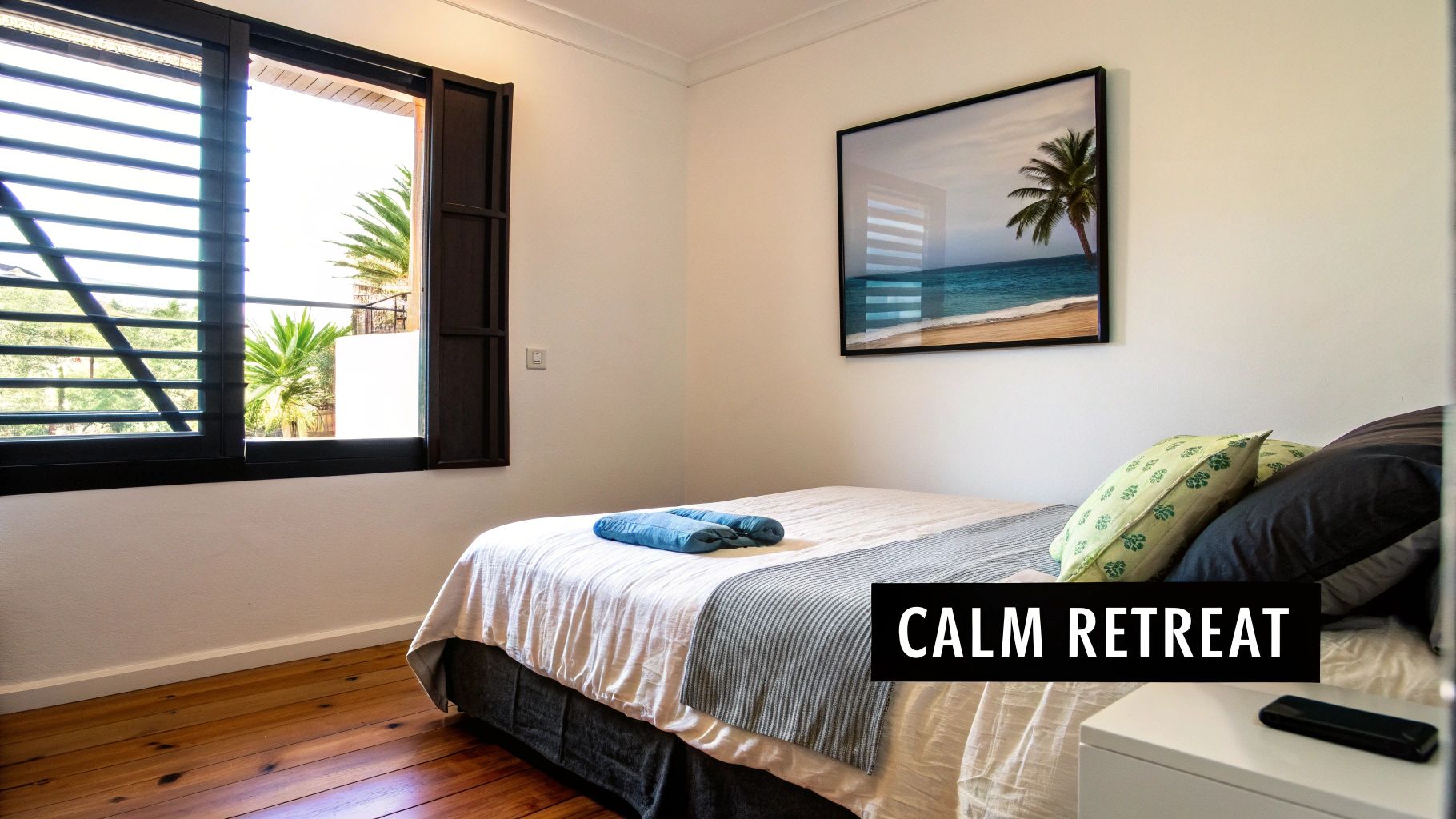
Deep Blues: Navy, indigo, and cobalt offer a sense of depth and sophistication. Far from making a room feel dark, these rich hues create a cozy, enveloping sensation of safety. A navy blue accent wall in a bedroom can feel like a protective embrace, encouraging deep, restorative sleep.
Blue and Its Financial Appeal
The calming influence of blue has a tangible impact that extends even into the real estate market. Studies have consistently linked blue to reduced heart rates, which is a major reason it’s the go-to for bedrooms. In fact, a Zillow study found that homes with navy blue bedrooms sold for an extra $1,800, as buyers saw these spaces as modern, restful sanctuaries.
Underscoring its versatility, a 2023 survey of top designers revealed that blue's earthy cousins, greens and teals, were used in every type of room. As one designer put it, "There is a shade of it for everyone." This data makes it clear that designing with blue isn't just an aesthetic decision—it's a smart investment in both your well-being and your property's value.
Art as an Emotional Anchor
One of the most powerful ways to introduce and amplify the calming effects of blue is through artwork. A single statement painting can become the emotional centerpiece of a room, setting the tone for the entire space.
An ocean-inspired painting does more than decorate a wall; it becomes a portal. It invites the rhythmic calm of the waves and the boundless peace of the sea directly into your environment, reinforcing the room’s purpose as a sanctuary.
Imagine a large canvas depicting a serene seascape. It instantly becomes the room’s focal point. Its various shades—from the deep navy of the distant water to the pale blue of the sky and the frothy white of the waves—give you a ready-made palette. You can pull the darkest blue for an accent wall, a mid-tone for your textiles, and the lightest hues for trim and accessories.
This approach creates a completely cohesive and immersive experience. The artwork is no longer just an addition; it's the very source of the room's calm. Pieces like Skyler's Foam of the Sea capture this dynamic perfectly, using textured blues and whites to evoke the restorative power of the ocean. By anchoring your design with such a piece, you ensure the atmosphere of serenity is both intentional and deeply felt.
Grounding Your Space with Earth Tones and Neutrals
While vibrant colors can energize a room and cool tones bring a sense of calm, there’s an undeniable feeling of belonging that comes from the quiet strength of earth tones. Think of deep charcoals, rich browns, and muted greens—these shades tap into our primal connection to the natural world. When your goal is to create a space that feels secure, stable, and deeply comfortable, these colors are the very foundation of color psychology in interior design.
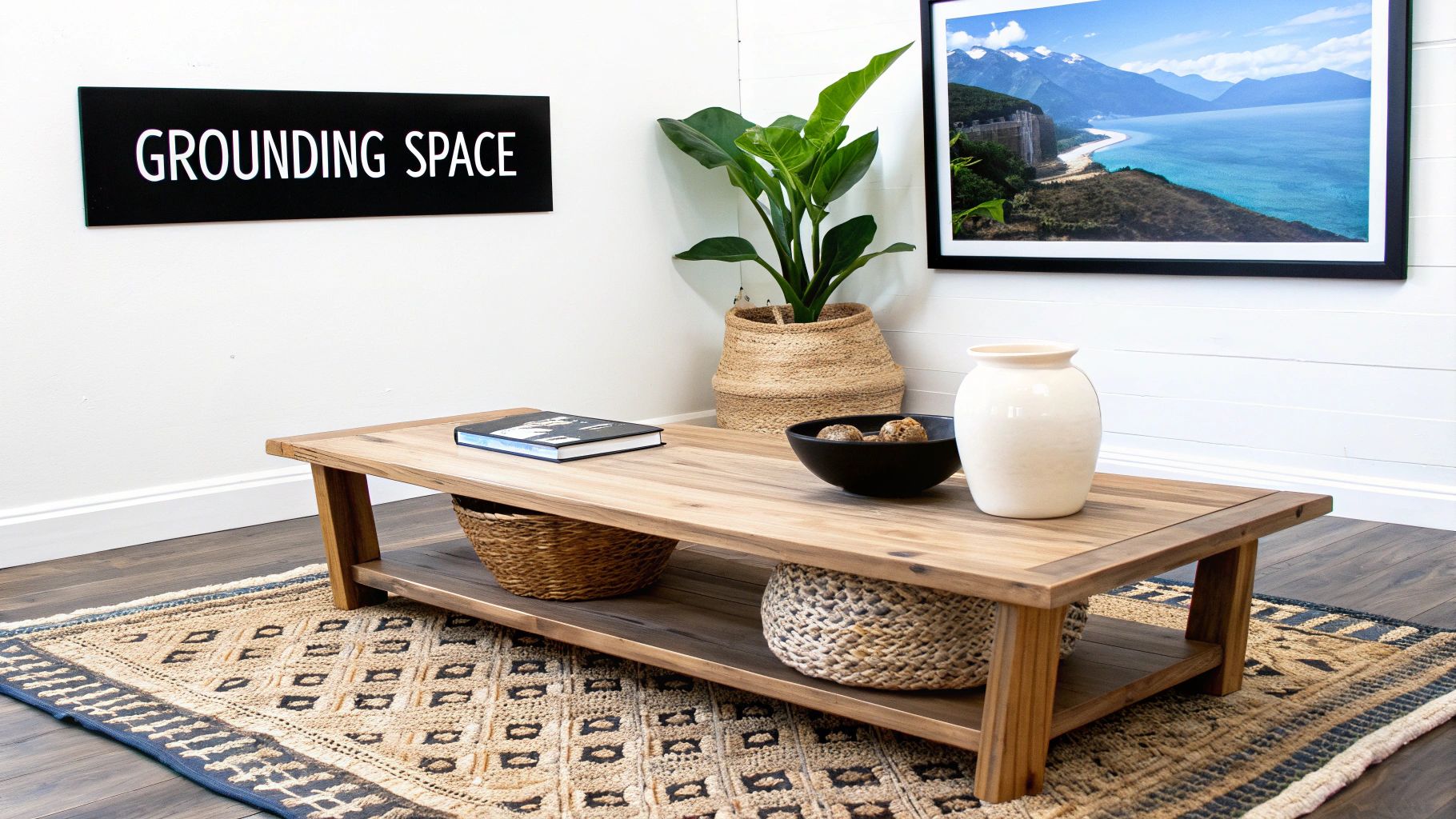
Imagine the feeling of walking through a silent forest or the solid, reassuring presence of a mountain range. Earth tones bring that same sensation indoors. This makes them a perfect fit for spaces dedicated to connection and relaxation, like living rooms, dining areas, or a favorite reading nook. They are the ultimate grounding force in any design palette.
The Versatility of Natural Palettes
Perhaps the greatest strength of earth tones and neutrals is their incredible versatility. They aren't a one-trick pony; they can play several different roles within a room, each with its own emotional impact. This adaptability is what makes them such a sophisticated choice for nearly any design style.
-
As a Nurturing Foundation: Walls painted in a soft beige or a warm gray create a gentle, nurturing backdrop. This allows other elements, like bold furniture or expressive art, to take center stage without feeling overwhelming.
-
As a Sophisticated Statement: You can also use these tones to make a powerful statement. A deep charcoal accent wall or a rich chocolate-brown sofa can serve as a potent anchor, giving a room a sense of gravity and refined elegance.
-
As a Harmonizing Element: Muted greens, such as sage and olive, are fantastic at bridging the gap between other colors. They create a cohesive and balanced environment that just feels calm and restorative.
Recent trends are definitely leaning into these grounding hues. Deep charcoals and earthy browns are seeing a huge surge in popularity for their stabilizing presence, with some reports showing a 50% uptick in the use of dark accents in homes across the U.S. and Europe. Research links these colors to a greater sense of security and a stronger connection to nature, which can help reduce feelings of anxiety. This preference can even have a financial benefit; Zillow data has shown that kitchens with dark olive green paint sold for $1,600 more, blending the cozy appeal of brown with a distinctly modern edge. You can explore more about current color trends in this insightful article.
Anchoring the Room with Art
Artwork is an exceptionally powerful tool for amplifying the grounding qualities of an earth-toned palette. A painting featuring symbolic landscapes, clay-like textures, or rich, earthy pigments can become the very soul of the room. It reinforces that all-important connection to nature and adds a layer of authenticity to your design.
An abstract landscape in shades of ochre, sienna, and slate does more than just match the decor. It introduces a narrative of resilience and timelessness, making the entire space feel more rooted and substantial.
When you select art that echoes these natural colors, you create a focal point that embodies the room's intended feeling of stability. The artwork and the surrounding decor begin to work in harmony, each strengthening the other's psychological impact. This synergy results in a space that feels not just decorated, but truly and deeply settled.
Building Your Cohesive Color Palette
Moving from the theory of color psychology into the real world of design requires a game plan. You can't just pick a few colors you like and hope for the best. Building a truly cohesive palette is about crafting a deliberate, harmonious scheme that tells a single emotional story. When done right, every element in the room works in concert to create the exact atmosphere you're aiming for.
One of the most reliable methods designers turn to is the 60-30-10 rule. Think of it as a simple recipe for a perfectly balanced space. It's a professional trick that keeps your color choices looking intentional, not chaotic.
The 60-30-10 Rule Explained
This classic design guideline gives you a clear structure for distributing color. It's all about making sure one color sets the overall tone, a second adds interest, and a third delivers that final, memorable punch.
Here’s the breakdown:
- 60% Dominant Color: This is your room’s main color, the canvas for everything else. It typically covers the largest areas—think walls—and establishes the primary mood.
- 30% Secondary Color: This color is there to support the dominant hue, offering a bit of contrast and depth. You’ll often see it on larger furniture items like a sofa, the curtains, or even an accent wall.
- 10% Accent Color: Here’s where the personality comes in. Used sparingly on smaller items like throw pillows, lamps, or decorative objects, this color adds that final spark of visual interest that completes the look.
Using Art as Your Palette's Foundation
Struggling with where to begin? Look to the art on your walls. A piece you already love can be the perfect foundation for building a sophisticated and deeply personal color scheme. A compelling painting—say, an ocean-inspired canvas—is essentially a professionally balanced palette, already curated by the artist. All you have to do is pull the colors from it.
A single painting can serve as the ultimate design brief. It not only offers a pre-made palette of dominant, secondary, and accent colors but also injects the artist's intended emotion directly into the fabric of your space.
Putting this into practice is straightforward. Start by identifying the most prominent color in the artwork; this becomes your 60% dominant shade for the walls. Next, find a color that's less widespread but still significant in the piece. That's your 30% secondary color, perfect for guiding your furniture or rug choices.
Finally, pinpoint the most vibrant or contrasting hue—even if it's just a small detail in the painting. This will be your 10% accent, which you can sprinkle throughout the room in small decorative elements. Learning a bit about artistic color mixing can give you a better appreciation for how artists achieve these powerful combinations. With this approach, a piece of art becomes more than just decoration; it’s the very blueprint for your room's soul.
Understanding How Light and Texture Affect Color
That paint swatch you picked up at the store is really just a starting point. It’s a suggestion of what a color could be, but the moment it goes on your wall, it starts a new life. Its psychological effect is never fixed; it's constantly being shaped by two of the most critical elements in any room: light and texture.
Think of a color as a single musical note. On its own, it has a distinct pitch. But the character of that note—its timbre—changes entirely depending on the instrument that plays it. A C-note sounds vastly different on a violin than it does on a cello. In your home, light and texture are the instruments, giving a single hue countless different expressions.
Mastering color psychology in interior design is really about understanding this dynamic relationship. A color doesn't work in isolation; it has to be in harmony with the unique conditions of the space to create the atmosphere you're after.
The Decisive Role of Lighting
If there’s one thing that can completely transform a color, it’s light. Lighting is arguably the most powerful factor influencing how we perceive any hue. The type of light, its direction, and even its temperature can turn a soft sage green into a zesty lime or a deep charcoal into a moody, soft gray.
We generally deal with two kinds of light in our homes:
- Natural Light: The quality of daylight a room gets is dictated by which direction it faces. North-facing rooms tend to have cool, indirect light that can wash out warmer tones and amplify blues and grays. South-facing rooms, on the other hand, are flooded with bright, warm light all day, making nearly every color pop.
- Artificial Light: Your choice of lightbulbs is just as crucial. Old-school incandescent bulbs cast that familiar warm, yellow-hued glow that makes reds, oranges, and yellows feel even cozier. Modern LEDs are incredibly versatile and can be selected for a specific color temperature, from crisp, cool white to a warm, inviting amber.
How Texture Gives Color a Voice
Texture is what dictates how a surface plays with light, and that interaction changes how we experience its color. A smooth, glossy surface bounces light around, making a color feel brighter, cleaner, and more energetic. A rough, matte surface does the opposite—it absorbs light, lending the same color a deeper, softer, and more muted quality.
Texture is what allows you to not just see a color, but to feel it. It adds a tactile dimension to the visual experience, making a space feel richer and more complete.
Here’s how this plays out in the real world:
- Velvet vs. Silk: Imagine a deep blue velvet sofa. It soaks up light, making the color feel complex, luxurious, and incredibly rich. Now, picture that same shade of blue on a silk pillow. It would shimmer and reflect light, appearing airy, lustrous, and much brighter.
- Rough Wood vs. Polished Metal: An earthy brown on a reclaimed wood table feels rustic, solid, and grounding. Take that same brown and apply it as a polished metallic finish, and it suddenly feels sleek, industrial, and modern.
This interplay is where truly layered and immersive design happens. It’s a concept artists have mastered for centuries, and you can see it beautifully demonstrated in various impressionistic painting techniques, where textured brushwork completely alters a color’s mood. By choosing materials that support your color’s emotional goal, you elevate your design from simple decoration to true atmospheric creation.
Common Questions About Color in Interior Design
Even after you've grasped the theory behind color psychology, the practical side of decorating can still feel a bit daunting. Turning those ideas into a beautiful, emotionally resonant space often comes down to navigating a few common dilemmas. Let's walk through some of the questions that come up time and again.
How Do I Choose the Right White Paint?
This is a classic for a reason. The secret to picking the "right" white is understanding its undertones. For a warm, inviting feel in a living room or bedroom, look for whites with a whisper of yellow or pink. These shades create a cozy, welcoming glow, especially when they catch the natural light.
On the other hand, if you're aiming for a crisp, modern aesthetic in a kitchen or bathroom, a pure white or one with cool blue or gray undertones is your best bet. Always, always test a large swatch on your wall. You'll be amazed at how different it looks throughout the day as the light changes.
Can I Use Bold Colors in a Small Room?
Yes, you absolutely can. The old rule that small rooms must be painted white to feel larger is one of the most persistent myths in design. A deep, bold color—think navy blue or charcoal gray—can make a small space feel dramatic, intimate, and incredibly sophisticated. The goal is intentional coziness, not avoiding a "cramped" feeling.
The key to pulling this off is great lighting, both natural and artificial. You need to flood the space with light. Incorporating reflective surfaces like mirrors and metallic accents will also bounce that light around, making the bold color choice feel deliberate and impactful.
What Is the Best Way to Use Art for a Color Palette?
A piece of art is perhaps the best starting point you could ask for. It's a pre-made color scheme waiting to happen. Start by identifying the main colors in the painting you've chosen.
A simple, professional method is to follow the 60-30-10 rule. Use the artwork's most dominant color for about 60% of your room (think walls). A secondary color becomes your 30% (for larger furniture pieces). Finally, pull one or two of the brightest, most vibrant colors from the piece to use as 10% accents in pillows, throws, or decor.
This strategy guarantees a unified, cohesive interior that tells a compelling story, all centered around a piece of art you already love.
How Does Paint Finish Affect Color?
A paint’s finish, or sheen, has a massive impact on how you perceive a color. A matte or flat finish absorbs light, which is great for hiding minor imperfections on your walls. It makes colors appear softer and more uniform, perfect for creating a serene, velvety look.
In contrast, glossier finishes like satin or semi-gloss reflect light. This makes colors appear brighter and more vibrant. That reflective quality also makes them more durable and easier to clean, but be warned—it will highlight every little bump and flaw on the wall's surface.
At Skyler’s Art, every painting is its own emotional landscape, offering the perfect foundation for a space that truly feels like you. Explore the gallery to discover the piece that will inspire your next design project.
Article created using Outrank